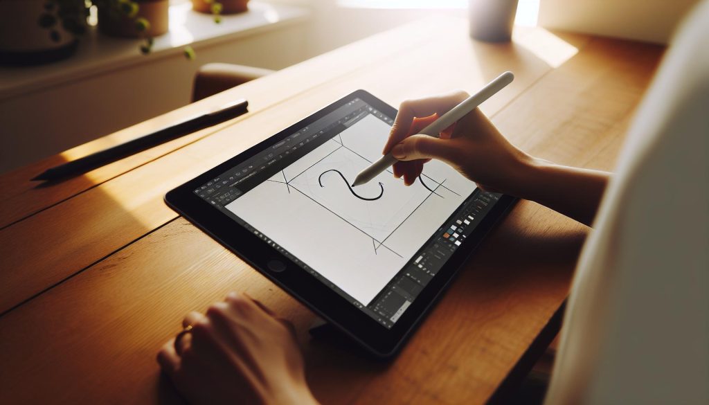
Have you ever admired the elegance of calligraphy but felt overwhelmed by the tools and techniques? With Procreate, you can create stunning calligraphy pens right at your fingertips, making the art of beautiful lettering accessible to everyone. This digital setup guide will walk you through the steps to design your own calligraphy brush in Procreate, unlocking endless creative possibilities for your projects. Whether you’re a seasoned artist or just starting, mastering this skill can elevate your designs, enhance your digital illustrations, and add a personal touch to your work. Let’s dive in and transform your digital canvas with the timeless beauty of calligraphy!
Choosing the Right Brush Settings for Calligraphy
Choosing the right brush settings in Procreate can transform your calligraphy from basic to breathtaking. It’s not just about picking a brush and going with it; adjusting settings to match your unique style is essential for achieving those smooth, elegant strokes common in traditional calligraphy. Here are some key tips to help you make the most of Procreate’s brush settings.
First, start with a brush that resembles a traditional calligraphy pen. Procreate offers various brushes, but you’ll want to select one with a soft, tapered edge. From there, head into the brush settings and tweak the Size and Opacity parameters. You might prefer a larger size for bold strokes, but reduce the opacity for fine detailing. Experimenting with these settings can yield dramatic results, so don’t hold back!
Next, adjust the Streamline feature. This setting helps create smoother lines, essential for elegant calligraphy. Setting it too high, however, may result in loss of the natural hand-drawn effect, so find a balance that suits your style. Don’t forget to play with taper settings, which control how the brush ends. A significant taper can mimic the natural pressure sensitivity of real ink pens, giving you artistic control over how each stroke appears.
Lastly, check the Stabilization and Pressure Curve options. Stabilization can steady your hand for those intricate swirls, while the pressure curve allows you to define how hard you need to press for different effects. A well-calibrated curve means your light touches produce delicate lines, while firmer pressure creates bold, striking strokes.
In summary, the right brush settings in Procreate are about personal preference and experimentation. Adjust size, opacity, and stabilization as needed, and soon you’ll find the perfect settings that reflect your unique calligraphic voice. So grab your iPad, dive into the brush settings, and let your creativity flow!
Step-by-Step Guide to Creating Your Calligraphy Pen

Creating a calligraphy pen in Procreate is a game changer for anyone looking to elevate their digital lettering skills. The beauty of Procreate is that you can craft a brush as unique as your handwriting. Here’s how to do it step by step, guiding you from the initial setup to fine-tuning the brush for perfect strokes.
Start by opening Procreate and navigating to the Brush Library. Tap the + icon in the top right corner to create a new brush. This opens the Brush Studio, where you’ll be able to customize every aspect of your new calligraphy pen.
Next, focus on the Shape of your brush. Here, you want to choose a base shape that mimics a traditional calligraphy nib-something with a tapered edge works wonderfully. Tap on Shape Source and select a shape from the gallery or create your own by importing an image. This shape dictates how the brush looks as it interacts with the canvas.
Once you’ve selected your shape, head over to the Grain section. This aspect adds texture to your brush, giving it a more realistic ink feel. Choose a grain source that aligns with traditional calligraphy paper or even your design style. You can adjust the scale and rotation to perfect how the texture interacts with strokes.
Now it’s time to adjust the Stroke Path settings. Increase the Spacing for a more fluid experience, or play with the Jitter to add character to your strokes. For calligraphy, keeping the spacing tight is often best, as it replicates the look of continuous ink flow. Adjust the StreamLine slider to make your lines smoother but remember that too much smoothing can remove the organic feel of hand lettering.
After these preliminary settings, dive into the Dynamics section. Here’s where you’ll configure how your pen feels with pressure. Adjust the Size and Opacity settings to respond to pressure sensitivity-that’s where the magic happens. Set the Pressure Curve to determine how much pressure is needed for different effects: a softer touch for fine lines and a harder press for bold strokes.
Lastly, preview your brush by drawing a few strokes on the canvas. Tweak the settings as necessary until it feels just right. Don’t be afraid to experiment-sometimes the best results come from pushing the boundaries of standard brush settings. Once you’re thrilled with your creation, save your brush and name it something memorable.
With this digital pen tailored for calligraphy, you’re now ready to create stunning lettering that looks authentic and uniquely yours. Happy drawing!
Mastering Pressure Sensitivity for Perfect Strokes

To achieve those stunning, fluid strokes in your digital calligraphy, mastering pressure sensitivity is essential. The difference between a thin, delicate line and a bold, impactful stroke often boils down to how well you manage the pressure on your stylus. In Procreate, this feature can turn your simple brush settings into a game-changing tool for your lettering.
Start by diving into the Dynamics section of the Brush Studio. Here, you’ll fine-tune how your brush responds to pressure. You’ll see two primary settings: Size and Opacity. For calligraphy, adjusting the size responds dramatically to how hard you press. With a lighter touch, your stroke should taper, while a firmer touch creates a thicker line, mimicking the natural behavior of a traditional nib. Play around with these settings until you find a balance that feels right. You want a subtle but responsive flow that captures the essence of hand lettering.
The Pressure Curve is your next focus. This feature allows you to customize how quickly or slowly your brush reacts to pressure. For example, if you want a softer transition between thin and thick strokes, drag the curve up higher. Conversely, if you need a more pronounced effect, flatten it out. This adjustment can make a significant difference, providing you the flexibility to create varying weights in your calligraphy effortlessly.
It’s all about practice. I recommend drawing a variety of strokes using different pressures to see how your brush responds. Experiment with creating swirls, loops, and even simple letters while changing your pressure continuously. This hands-on experimentation will build muscle memory and give you a better feel for how pressure sensitivity can enhance your digital calligraphy.
Eventually, don’t forget to save your favorite settings once you’ve dialed them in. You might create multiple brushes with different pressure responses for various styles, giving you a versatile toolkit for all your lettering needs. Happy illustrating!
Customizing Your Calligraphy Brush with Textures

To take your digital calligraphy to the next level, customizing the textures of your brushes can add a unique richness to your lettering that mimics traditional mediums. Texturing your brush not only enhances the visual appeal of your strokes but also provides a tactile quality that can make your work stand out. So, let’s get into how you can easily do this in Procreate.
Start by accessing the Brush Studio in Procreate. Here, you’ll find a section dedicated to Grain. This is where you can either select a built-in texture or import your own. If you want that organic look, consider using textures like canvas or paper, which can create a more traditional feel. Just tap on “Grain Source” and choose a texture that resonates with your style. You can also adjust the Scale and Rotation of the grain to ensure it seamlessly integrates with your brush strokes.
Once you’ve selected a texture, it’s essential to tweak the Brush Dynamics. Look at the Moisture, Flow, and Opacity settings. Increasing moisture can add variance to how the color lays down, making your strokes look more natural and fluid. Play around with these settings to find the sweet spot that aligns with your creative vision. Also, consider how different textures interact with lighting: some may enhance shadows and depth while others keep it subtle.
Another fun technique is layering different textures. For instance, you can create a brush that has a grainy base texture combined with a soft watercolor effect. This combination can yield stunning results, reminiscent of mixed media artwork. To do this, simply create multiple brushes with different textures and alternate between them while you’re working. This method can lead to unexpected and delightful outcomes, encouraging a playful exploration of your style.
Don’t forget to test your newly textured brush by drawing different characters and design elements. Look for opportunities to incorporate it into your work, noting how it changes the overall feel of your calligraphy. Each brush stroke tells a story; the right texture will enhance that narrative, making your digital calligraphy not just a visually appealing piece but a powerful form of expression. Experimenting and finding the perfect textures will transform your digital calligraphy practice into a delightful journey of artistic discovery.
Exploring Advanced Techniques for Digital Calligraphy

To elevate your digital calligraphy, mastering advanced techniques can make a significant difference in the quality and uniqueness of your work. One effective method is to combine different brush settings to create diverse effects. For instance, experimenting with the spacing and taper settings of a brush can yield striking visual results. You might find that a wider spacing gives your letters an airy, elegant feel, perfect for more dramatic pieces, while tighter spacing can produce a more structured and confined look.
Another powerful approach is the use of *layer styles* within Procreate to enhance your strokes. By applying a subtle glow or shadow, you can give your lettering a three-dimensional quality that can attract viewers’ attention. Layer blending modes like Multiply and Overlay can create dynamic interactions between colors and textures, enriching the depth of your artwork. Don’t shy away from mixing styles! For example, combining a traditional calligraphy brush with a splatter or texture brush can yield innovative and eye-catching typography.
Pressure sensitivity is another critical element that advanced calligraphers should utilize. Fine-tuning your pressure settings can allow for breathtaking transitions between thick and thin lines, breathing life into your strokes. Use the Pressure Curve settings in Procreate to customize how sensitive your brush is to your touch. This adjustment can be particularly effective when creating phrases that require dramatic flair-think of achieving those bold downstrokes followed by delicate upstrokes that define great calligraphy.
For further inspiration, dive into incorporating mixed media techniques. Combine traditional calligraphy styles with digital elements such as watercolor washes or textured backgrounds. This not only creates visual contrast but also enables a rich dialogue between different artistic mediums. Consider using Procreate’s selection tools and layer masks to control where your colors blend and where your crispy, clean lines stand out.
Finally, always remember to keep experimenting! Digital calligraphy is about creativity and exploration. The more you play around with tools and settings, the more you’ll discover unique styles that resonate with your artistic voice. Keep an open mind, and remember: every line you draw is an opportunity to express something new.
Tips for Blending Colors and Creating Gradients
Blending colors and creating gradients in Procreate can elevate your digital calligraphy from good to stunning. Don’t just settle for flat colors; bring your letters to life with beautiful transitions and depth. Mastering this technique not only enhances the visual appeal of your work but also allows for a more expressive style that can captivate your audience.
To start, consider using the Blending Tool effectively. With this tool, you can smoothly transition between colors, creating seamless gradients. Just select the brush tool, then choose a soft brush from the Procreate brush library. Use it to gently swipe between colors. Be sure to adjust the opacity of your brush for more control over how much blending occurs. A lower opacity gives you a softer transition, while a higher opacity will mix colors more boldly.
Another essential technique is the Color Fill and Gradient Layer. Create a new layer above your calligraphy and fill it with a solid color. Then, tap on the layer and select “Clipping Mask.” This way, the gradient will only show through your lettering, allowing your calligraphy to serve as a canvas. Experiment with the Gradient Tool by dragging across your layer from one color to another. Adjust the gradient’s direction and colors to fit your vision, and don’t forget to play around with the layer’s opacity for an added effect.
Let’s not forget about layering. Using multiple layers is key in Procreate, as it allows you to blend colors without losing the base of your design. Stack different colored layers under your calligraphy, each with varying opacity. Blend them together to create shadow effects or highlights. This method adds dimension and can transform a simple letter into a captivating piece of art.
Lastly, always take advantage of the Opacity and Gaussian Blur features. For softer blends, apply Gaussian Blur to your layer lightly. This can help to smooth out transitions even more. Adjusting layer opacity can give you a more transparent look that allows the background to peek through, creating a unique and ethereal effect.
With these tips, you’ll not only achieve beautiful blended colors but also develop a signature style that impresses everyone who sees your work. Just remember: practice makes perfect. Don’t be afraid to experiment and find what techniques resonate with your artistic flair.
Essential Procreate Tools for Stunning Calligraphy
To truly elevate your digital calligraphy in Procreate, mastering the right tools is essential. One of the finest aspects of Procreate is its versatility, with several built-in tools and features that can help you create stunning lettering. Start with the Brush Library, where you can select brushes specifically designed for calligraphy. Look for brushes with tapered ends or those labeled as ‘calligraphy’ or ‘ink’ to achieve those delicate strokes. You can even customize these brushes to fit your unique style-don’t hesitate to adjust the size, shape, and dynamics based on how you want your letters to flow.
Another game changer is Pressure Sensitivity. If you’re using an Apple Pencil, take advantage of this feature. By adjusting the pressure curve in your brush settings, you can create beautiful, variable lines that mimic traditional calligraphy. Light pressure can yield fine details, while heavier pressure gives you bold strokes. This nuance adds depth and dimension to your calligraphy, transforming simple letters into captivating art pieces.
Don’t overlook the QuickShape feature. This nifty tool allows you to perfect your shapes, whether you’re forming loops or straight lines. Just create your stroke, hold it in place for a second, and Procreate will smooth out your line into a perfect curve. This is particularly useful for letters that require precision, ensuring your work remains polished and professional.
Utilizing Layers effectively cannot be stressed enough. When working on your calligraphy, create a separate layer for each color or element. This separation allows for easier adjustments. If you mess up, just hide or delete that layer instead of starting over. Plus, layering enhances your designs, letting you play with transparency and effects without affecting your original work.
Lastly, make sure to explore the Color Picker and Palette options. Having a cohesive color palette can significantly enhance the overall look of your work. You can create custom palettes tailored to your project, making it easier to maintain consistent colors throughout your calligraphy.
With these essential tools at your disposal, you’re equipped to create breathtaking digital calligraphy that stands out. Remember, experimentation is key-don’t be afraid to play around with different brushes and settings until you find what truly resonates with your artistic vision.
Common Mistakes in Digital Calligraphy to Avoid
Diving into digital calligraphy can be incredibly rewarding, but it’s easy to fall into a few common pitfalls that can hinder your progress. One of the biggest mistakes is skipping brush settings adjustments. Many newcomers assume that the default settings will suffice, but every brush behaves differently. Spend time experimenting with size, taper, spacing, and pressure settings to find the right configuration that suits your style. This personal touch can transform your work from basic to breathtaking.
Another common issue is overusing layers without purpose. While Procreate allows you to create multiple layers, it’s crucial to use them strategically. If every element is on a separate layer without any reason, it can get confusing and messy. Instead, categorize layers logically-keep related elements together and name them for easy navigation. This organization not only enhances your workflow but also helps in making quicker adjustments without wasting time.
Don’t overlook the power of color theory. It’s tempting to grab your favorite hues and go wild, but harmony matters. Beginners often neglect to create a cohesive palette, leading to jarring combinations that can overshadow your lettering. Select a color scheme before starting your piece, and stick to it for a more polished look. Remember, there is beauty in simplicity, and sometimes less is more.
Lastly, it’s easy to feel pressured to produce perfect work right away, which can lead to frustration and burnout. Avoid comparing your journey to others; every artist grows at their own pace. Instead, focus on progress, not perfection. Celebrate small wins, learn from your mistakes, and keep your creative spark alive by routinely experimenting without the fear of failure. That’s where true artistry flourishes.
Inspiration: Styles and Trends in Digital Calligraphy
Digital calligraphy is a vibrant, evolving art form that continuously inspires creativity. As you explore various styles, you’ll find that trends can dramatically transform your approach and outcome. One of the most striking trends is the use of modern brush lettering, which combines traditional calligraphic techniques with a contemporary twist, giving your work a fresh and approachable feel. The thick and thin contrasts achieved through varied pressure sensitivity create an eye-catching, fluid motion that draws viewers in.
Experimenting with watercolor effects is another exciting trend. Digital artists are blending colors seamlessly to mimic the organic flow of watercolors on paper. This technique allows for beautiful gradients and soft finishes that enhance the overall aesthetic of your lettering. Using Procreate, you can incorporate multiple layers of color, adjusting transparency to achieve depth and richness that adds an artistic flair reminiscent of traditional mediums.
Additionally, there’s a notable shift towards integrating hand-lettering with digital illustrations. Pairing your calligraphy with whimsical graphics or playful doodles not only showcases your versatility but also captivates an audience eager for unique and personalized content. This style is perfect for social media, printables, and branding, providing an engaging way to tell a story through your art.
Lastly, don’t underestimate the influence of typographic inspiration from social media platforms like Instagram or Pinterest. Following top calligraphers and artists can illuminate the latest styles and ignite your creativity. Whether it’s a bold script or a delicate serif, these trends offer plenty of fodder to refine your own aesthetic and push the boundaries of your digital calligraphy practice. Dive into these styles and let them inspire your next piece!
Showcasing Your Calligraphy: Best Practices for Sharing
Whether you’re showcasing your calligraphy on social media or presenting it in a portfolio, how you share your work can make all the difference in how it’s perceived. Start by ensuring that your digital calligraphy looks its best. High-resolution images are key-opt for settings that maintain the crisp lines and vibrant colors inherent in your art. When sharing on platforms like Instagram, use formats that prevent pixelation. Aim for at least 300 DPI (dots per inch) to capture the details, especially if you plan to print your work later.
Lighting plays a crucial role in the presentation of your calligraphy. Natural light is ideal, as it provides a soft and flattering glow without harsh shadows. If you’re photographing your work indoors, position your setup near a window during the day. Experiment with different angles, but try to avoid directly overhead shots. Instead, a 45-degree angle often captures the texture and depth of the strokes beautifully. If you’re using Procreate, consider exporting your artwork against a complementary background to enhance its appeal.
When it comes to sharing on social media, storytelling is powerful. Don’t just post your calligraphy; share the process! Use stories or short videos to show your progress, from the initial sketches to the final piece. This not only engages your audience but also invites them into your creative journey. Remember to use relevant hashtags to reach wider audiences. Research trending tags like #DigitalCalligraphy, #ProcreateArt, or #HandLettering to connect with fellow artists and potential fans.
Lastly, don’t forget to engage with the community. Respond to comments, ask for feedback, and participate in challenges or collaborations. Sharing your calligraphy is not just about displaying your art; it’s about building connections. The more active you are, the more visibility your work will gain, and the more inspiration you will draw from others. This mutual exchange enriches your practice and expands your artistic horizons. Keep creating, keep sharing, and watch your community grow!
Experimenting with Calligraphy Fonts in Procreate
When diving into the world of digital calligraphy in Procreate, experimenting with fonts opens up a realm of creative possibilities. You can take your designs from basic to breathtaking with a few simple tweaks. Start by exploring the extensive range of calligraphy fonts available within Procreate or through external downloads. Don’t just settle for what’s standard-get inspired by your favorite artists or find unique styles that resonate with your aesthetic.
To get started, try out a few different Procreate brushes to see how they interact with various fonts. For instance, using a textured brush can add depth and personality to otherwise flat font designs. Thicker brushes paired with light touch pressure can mimic the look of traditional calligraphy, while lighter brushes might suggest an elegant, minimalist feel. Don’t hesitate to layer your strokes; creating a faux-layered effect can make even simple letters look dynamic and engaging.
One of the most effective techniques is layering text with transparent elements for a more customized look. You can create shadows and highlights by duplicating your text layer and adjusting the opacity or blur effects. This adds dimension and makes your work stand out. Additionally, consider color experimentation. A bold color palette or subtle gradients can transform plain text into eye-catching pieces.
Finally, don’t forget to take advantage of Procreate’s Alpha Lock feature to paint within the confines of your letters. This allows you to add details, textures, or even images that fit perfectly into the shapes of the characters. The key is to treat each font as a canvas, inviting your unique spin to enhance its character. The more you play around, the more you’ll develop a personal style that reflects your artistic voice. So, grab your stylus and start experimenting-it’s a fun and liberating part of your calligraphy journey!
Frequently Asked Questions
Q: What are the best brush settings for calligraphy in Procreate?
A: The best brush settings for calligraphy in Procreate typically include a tapered brush that mimics a real pen. Adjust the size, opacity, and flow settings to achieve smooth, consistent lines. Experiment with the streamline option for smoother strokes. For detailed guidance, check out the section on Choosing the Right Brush Settings for Calligraphy.
Q: How do I customize a calligraphy brush in Procreate?
A: To customize a calligraphy brush in Procreate, open the Brush Settings and tweak options like Shape, Grain, and Dynamics. You can also add textures for unique effects. For a thorough walkthrough, refer to the section on Customizing Your Calligraphy Brush with Textures.
Q: What techniques can I use to improve my digital calligraphy?
A: Improving your digital calligraphy involves practicing pressure sensitivity to control stroke thickness, using layering for depth, and mastering blending techniques for color variations. Explore Mastering Pressure Sensitivity for Perfect Strokes for detailed tips.
Q: How can I troubleshoot common calligraphy issues in Procreate?
A: Common calligraphy issues can often be solved by adjusting brush settings for smoother lines, checking your hand movements for consistency, and using the undo feature to correct mistakes. Visit the section on Common Mistakes in Digital Calligraphy to Avoid for practical solutions.
Q: Why is pressure sensitivity important in Procreate calligraphy?
A: Pressure sensitivity is crucial in Procreate calligraphy because it allows for variation in line thickness, adding depth and character to your strokes. This technique creates a more natural and dynamic look, essential for quality calligraphy work. Learn more in the Mastering Pressure Sensitivity for Perfect Strokes section.
Q: What are some tips for showcasing my digital calligraphy?
A: To effectively showcase your digital calligraphy, consider using high-resolution images, experimenting with different backgrounds, and sharing your work on social media platforms. For optimal presentation techniques, refer to the Showcasing Your Calligraphy: Best Practices for Sharing section.
Q: How do I find inspiration for my calligraphy styles in Procreate?
A: Finding inspiration for calligraphy styles in Procreate can be done through browsing art communities, following calligraphy hashtags on social media, and practicing different styles you admire. See the Inspiration: Styles and Trends in Digital Calligraphy section for more ideas.
Q: When should I consider using blending techniques in digital calligraphy?
A: Blending techniques should be considered when you want to create gradients or soft transitions between colors in your calligraphy. This adds visual interest and depth to your work. Check out Tips for Blending Colors and Creating Gradients for practical advice on blending.
The Way Forward
Now that you’ve mastered how to create a calligraphy pen on Procreate, it’s time to unleash your creativity! Remember, the digital setup isn’t just a beginning; it’s your gateway to stunning designs and personal expression. Don’t wait-dive into your projects today and watch your lettering skills flourish.
If you’re eager to enhance your skills further, check out our guides on Digital Brush Techniques and Advanced Calligraphy Styles. Join our community by subscribing to our newsletter for tips, tricks, and exclusive resources straight to your inbox!
Your journey into digital calligraphy doesn’t have to stop here. Share your creations with us in the comments below, and let’s inspire each other! Keep experimenting, keep creating, and make sure to explore more ways to elevate your art. Happy lettering!