
Have you ever admired elegant script and wished you could create it yourself? Learning to write with a dip pen not only unlocks the timeless art of calligraphy but also allows you to express your creativity in a unique way. Whether you’re looking to enhance your wedding invitations, craft personal notes, or simply enjoy a new hobby, mastering the classic technique of dip pen calligraphy can elevate your writing to an art form.
In this guide, we’ll dive into the essentials of using a dip pen-from selecting the right nib and ink to mastering essential strokes and techniques. You’ll discover practical tips that demystify the process, making it accessible even if you’re a complete beginner. So grab your pen and let your creativity flow; a beautifully scripted world awaits you!
Choosing the Right Calligraphy Dip Pen for You
Choosing the right calligraphy dip pen can transform your writing experience. With so many options available, it can be overwhelming, but the right pen might just be the key to unlocking your creativity and style. Think about your writing goals first-are you drawn to elegant scripts like Copperplate, or are you more interested in bold Gothic lettering? Understanding your preferred style will narrow down your choices significantly.
When selecting a dip pen, consider the nib type. Nibs come in various shapes and sizes, each designed for different styles of lettering. For instance, pointed nibs are excellent for fine lines and delicate transitions, perfect for flowing scripts. Flat nibs, on the other hand, are great for creating broader strokes, making them suitable for bolder scripts. It’s often helpful to grab a few different nibs and test them out to see what feels comfortable in your hand and produces the line quality you desire.
Moreover, the pen holder is just as crucial as the nib. Lightweight holders can feel more comfortable during long writing sessions, while heavier ones might provide better control. Experimenting with different materials, such as wood or plastic, can also influence your writing comfort. Don’t overlook the importance of a comfortable grip; a pen that feels good in your hand will allow you to focus more on your technique than on your instrument.
Lastly, remember to keep inks and paper in mind. Certain nibs work better with specific inks, so it’s worth doing some research on what pairs best. High-quality paper will also elevate your results, as it can handle the ink without bleeding or feathering. As you start your calligraphy journey, take the time to explore these options. The right dip pen can not only enhance your writing but also your enjoyment of the craft itself.
Understanding Calligraphy Dip Pen Anatomy
The anatomy of a dip pen is fundamental to mastering the art of calligraphy. Understanding the components of your pen can dramatically influence your control and the quality of your work. At the heart of any dip pen is the nib, a small yet crucial piece that directly interacts with your writing surface. Nibs come in various shapes: pointed nibs allow for fine lines and intricate details essential for scripts like Copperplate and Spencerian, while broader flat nibs excel at creating thick strokes ideal for bold lettering styles. Choose your nib based on the style you’re aiming to achieve, and don’t hesitate to experiment with different types to find what feels best in your hand.
Components of a Dip Pen
A typical dip pen consists of three main parts: the nib, the holder, and sometimes a reservoir or a ring to enhance control. The nib is the piece that touches the paper and can vary greatly in flexibility and thickness. A more flexible nib offers a wider range of line variation, allowing you to produce both delicate and bold strokes with ease. If you’re just starting, consider a medium-stiff nib as it provides a good balance of control and responsiveness.
The holder is equally important. It not only secures the nib but also provides comfort during extended writing sessions. Holders come in a range of materials, including wood and plastic, each offering different weights and grips. A lightweight holder may feel faster and more agile, while a heavier one can provide more stability-fit is personal, so try a few to see what you prefer.
Having a clear grasp of these components empowers you to make informed choices that suit your writing style. Always remember, the key to beautiful calligraphy lies in the synergy between the nib and holder, and the way you wield them. Explore, practice, and most importantly, enjoy the tactile experience of writing with a dip pen. The right tools will not just elevate your lettering-they’ll ignite your passion for the craft.
Essential Inks and Paper for Calligraphy
Choosing the right ink and paper for your dip pen isn’t just a matter of preference; it’s vital to your success in calligraphy. The wrong combination can lead to frustration, and trust me, I’ve been there. Imagine going through the painstaking process of crafting a beautiful letter only to have the ink bleed or the paper tear. That’s why understanding your options is essential.
When it comes to ink, you’ll find a range that caters to different styles and techniques. Quality is non-negotiable. Look for inks specifically designed for dip pens, as they’re formulated to provide smooth flow and consistent color. Dye-based inks are vibrant and dry quickly, making them ideal for everyday use and practice. However, if you seek rich, deep hues and don’t mind a bit of drying time, pigment-based inks are the way to go. They’re permanents and often water-resistant, which can elevate your work for special projects. Brands like Ink Potion or Sumi Ink are fantastic choices for both beginners and seasoned calligraphers.
Paper is another crucial element. Not all paper is created equal-some will absorb ink too quickly, causing feathering, while others might be too slick, leading to smudging. Look for papers labeled as calligraphy or fountain pen-friendly. A smooth, heavyweight paper allows your nib to glide effortlessly across the surface, yielding clean lines and sharp details. Bristol or smooth watercolor paper are usually excellent options. Test different weights and textures to find what complements your personal style. It’s worth investing time in this exploration to discover what feels best under your hand.
Inconsistency is the enemy of calligraphy. By selecting the right ink and paper, you’re setting yourself up for success right from the start. Thus, don’t shy away from experimenting. Your calligraphy journey is about finding what works for you, ensuring that each stroke is a joy rather than a hassle.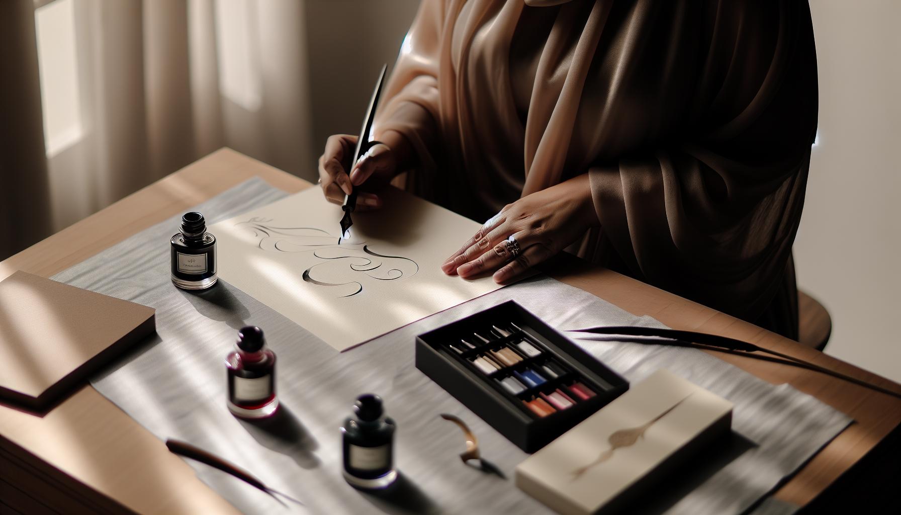
Mastering Basic Strokes: Your First Steps
Starting your journey with a calligraphy dip pen can feel a bit daunting, but mastering the basic strokes is where the magic begins. The beauty of calligraphy lies in the unique flow and shape of every letter, which is defined by these foundational strokes. Whether you’re crafting delicate serifs or bold loops, each stroke builds upon the previous one, allowing your style to flourish.
To begin, grab some practice paper and your dip pen loaded with ink. Focus first on vertical and horizontal lines. These lines are the backbone of most letterforms, so take your time. Practice drawing them with varying pressure-pressing harder for thicker lines and lighter for thinner ones. Make sure to hold your pen at a consistent angle; typically, a 45-degree angle works well. Once you’re comfortable, move on to diagonal strokes, which often form the edges of your letters. Practice upward strokes angling from left to right and downward strokes from right to left. It’s all about finding your rhythm.
Next, let’s get into the curves. Circular strokes are essential in almost every calligraphy style. Start with small circles, gradually increasing their size as you gain confidence. Make sure to rotate your paper to keep your wrist relaxed. This allows for smoother lines and more controlled curves. Don’t rush; repetition is key to developing muscle memory. As you familiarize yourself with these shapes, try adding nuances-like swells or tapering at the ends of your strokes-to give your writing more flair.
Above all, practice patiently and consistently. Set aside a few minutes each day to refine your strokes, and keep a notebook of your progress. You might find that as you practice, not only do your strokes improve, but you also start to develop your own style. Enjoy the process! Each stroke is a step towards creating beautiful and expressive lettering. With every practice session, you’re weaving your artistic voice into the centuries-old tradition of calligraphy.
Creating Beautiful Letterforms: A Practical Guide
Creating beautiful letterforms is where the art of calligraphy truly shines. The elegance of each letter reflects your unique style, and mastering letterforms will set you apart. Begin by choosing a comfortable pen angle-usually around 45 degrees-which will significantly influence your letterforms. The key to achieving fluid, beautiful strokes lies in the pressure you apply while writing. Press harder for thicker lines and ease up for thinner ones. This contrast is essential for capturing the essence of each letter.
To start, focus on individual letters, breaking down their anatomy. For example, the letter “a” features both a rounded shape and a delicate ascender. Practice writing it in different styles-joined or looped-as this experimentation will help you discover your preference. It’s also invaluable to study examples of classic calligraphy styles, from Copperplate to Gothic scripts. Seeing these letters can inspire new ideas and help you visualize how to create them yourself.
Repetition is your best friend when it comes to refining your letterforms. Set aside time daily to practice specific letters or entire words. Don’t shy away from using guides or worksheets; they can be beneficial in keeping your proportions consistent. Remember, patience is critical. The more you practice, the more your hand will learn the motion and fluidity required for beautiful writing.
Finally, think about the context in which you’ll use your calligraphy. Whether you’re addressing envelopes, creating art pieces, or noting invitations, the presentation matters. Consider the spacing and alignment of your letters, as well as how they relate to each other on the page. This attention to detail will elevate your work from simply good to stunning. Embrace the process and let each stroke tell your story, weaving your personal style into the tradition of calligraphy.
Techniques for Consistent Pressure and Flow
To achieve stunning calligraphy, mastering consistent pressure and flow with your dip pen is essential. Many beginners overlook this crucial aspect, focusing solely on the shapes of letters. However, the way you control the pressure on your nib while writing can dramatically transform the look of your calligraphy. The difference between a thick and thin line often lies in how much pressure you apply during upward and downward strokes.
Start by familiarizing yourself with your pen and nib. Hold your pen at an angle-typically around 45 degrees-to maintain a comfortable grip and better control over pressure. When you press down on the nib during a downward stroke, allow it to spread slightly; this will create the thicker line that characterizes beautiful calligraphy. Conversely, for upward strokes, ease off the pressure to achieve a finer line. Try practicing this with simple exercises: draw straight lines while varying the pressure on your pen, and observe the changes in line thickness.
Another effective technique involves using light sketches in pencil before inking your letters. This allows you to experiment with pressure without the stress of ruining a final piece. As you become comfortable with this dynamic, integrate basic strokes-like loops and swirls-into your practice. These strokes are foundational and will help you build muscle memory for consistent pressure applications across all your writing.
Remember, practice is paramount. Set aside dedicated time to focus solely on pressure control. Spend minutes daily working on drills like the “upstroke and downstroke” exercise. You can create a simple worksheet with lines that require varying pressures as you write. Consistent practice not only enhances your skills but also instills confidence in your ability to produce beautiful and fluid calligraphy. Embrace the process, and don’t rush-over time, your control will improve, and your letters will shine with elegance.
Advanced Calligraphy Styles to Explore
Exploring advanced calligraphy styles opens up a whole new world of creativity. Once you’ve mastered the basics, diving into various styles can enhance your artistic expression and give your work a unique flair. Each style carries its own character and charm, so you can choose one that resonates with your personal aesthetic or the mood of your project.
One popular direction is Copperplate, known for its elegant, flowing script and intricate loops. This style requires precise penmanship and a firm grip on your pen technique. The beauty of Copperplate comes from its slant and the contrast between thick and thin strokes, which can be achieved by varying your pressure. There are plenty of exercises available online that can help you get comfortable with the specific strokes needed to create Copperplate letters.
Another captivating style is Gothic, which features bold, angular lines and dramatic flourishes. This medieval-inspired script tends to be more structured, with a focus on verticality and strong contrasts. Learning Gothic can truly transform your calligraphy projects, especially for invitations or artwork with a vintage feel. It’s an excellent way to explore the relationship between formality and creativity in your writing.
If you’re interested in adding a contemporary twist to your work, consider Modern Calligraphy. This versatile style allows you to break free from traditional constraints, encouraging a personal touch in your letterforms. You might mix print and cursive, or even incorporate varied thicknesses and styles within a single piece. Experimenting with chalkboard surfaces or watercolor backgrounds can create striking compositions that showcase your individual style.
Practical Tips for Mastering Advanced Styles
- Practice Consistently: Make it part of your daily routine to work on different styles. Focus on one style at a time to develop proficiency before moving on.
- Use Reference Materials: Books and online tutorials provide excellent visual guidance. Pay attention to stroke sequences and try replicating them.
- Join a Community: Connect with other calligraphers through online forums or local workshops. Sharing your work and getting feedback can significantly improve your skills.
By challenging yourself to learn advanced styles, you’ll not only elevate your calligraphy but also broaden your artistic horizons. Each style you explore adds another layer to your personal craft, making every piece you create a true reflection of your journey in calligraphy.
Common Mistakes and How to Avoid Them
Many newcomers to calligraphy stumble over some common pitfalls that can hinder their progress and enjoyment. Addressing these mistakes early on can save you a lot of frustration and time in your practice. One prevalent error is holding the dip pen incorrectly. If you’re gripping it too tightly or at the wrong angle, you’ll struggle to create those beautiful, fluid strokes you’ve admired in others’ work. Remember, the goal is to maintain a relaxed grip with the nib positioned at about a 45-degree angle to the paper for optimal ink flow.
Another frequent mishap involves using the wrong type of ink or paper. Not all inks behave the same way with a dip pen, and using low-quality paper may lead to unsatisfactory results, like bleeding or feathering. It’s vital to experiment with different inks, ideally those designed for calligraphy, and to choose smooth, heavy paper that can withstand the pressure without tearing. Investing in the right materials can make a significant difference in your learning curve.
Timing and pressure also play crucial roles in calligraphy. Many beginners apply inconsistent pressure while writing, leading to uneven line thickness. This is particularly important if you’re attempting styles like Copperplate, which are defined by their dramatic contrasts. Practicing basic strokes consistently-like the upstroke and downstroke-will help you develop the muscle memory needed to control your pressure better.
Finally, impatience can be your biggest adversary. It’s tempting to rush through the learning process to achieve stunning results, but beautiful calligraphy takes time and practice. If you find yourself frustrated, take a step back and focus on the basics again. Remember, every master was once a beginner. Consistency and a willingness to make-and learn from-mistakes will ultimately transform your journey in the world of calligraphy.
Personalizing Your Calligraphy Style
Every calligrapher’s journey is as unique as their handwriting, and is where the magic truly happens. It’s not just about mastering strokes; it’s about infusing your personality into your work. Start by experimenting with different nib types and sizes. A fine nib can yield delicate lines ideal for formal scripts, while broader nibs create bold strokes that can give your work a contemporary flair.
Discovering Your Inspiration
Look for inspiration in everyday life. Nature, architecture, and even personal experiences can guide your style. Try combining various influences. For example, if you adore vintage aesthetics and modern minimalism, create a hybrid style that reflects both. This doesn’t just make your calligraphy unique; it also makes the process of writing more enjoyable and fulfilling.
Creating a Signature Flourish
Once you’ve identified what resonates with you, develop a signature flourish. This could be a specific way of forming a letter or unique embellishments that set your work apart. Practice these flourishes separately until you can seamlessly incorporate them into your writing. Remember, this addition should enhance your letters, not overpower them.
Color and Material Choices
Don’t shy away from color-it’s a powerful tool to define your style. Experiment with different inks beyond standard black or blue. Metallics, pastels, or even a splash of watercolor can transform a simple creation into something extraordinary. Additionally, consider your paper choice; a textured surface can elevate your work compared to standard printer paper.
Personalizing your calligraphy isn’t a one-time effort-it’s an evolving journey. As you continue to practice, reflect on your progress, continually seeking ways to express who you are through your art. In doing so, you’ll find that your calligraphy becomes a beautiful representation of your individuality.
Inspiration: Stunning Calligraphy Projects
There’s something undeniably enchanting about bringing a piece of paper to life with elaborate lettering. Calligraphy isn’t just art; it’s storytelling through strokes and swirls. Whether you’re crafting wedding invitations, personalizing gifts, or simply expressing your thoughts, a stunning calligraphy project can elevate any occasion and make the mundane magical.
To get inspired, look into themed projects. For instance, consider creating seasonal greeting cards. Use a dip pen to write heartfelt messages surrounded by festive illustrations. Try mixing gold and silver inks to make your letters shine against dark, textured paper-think of the glamour of a winter holiday or the warmth of a summer wedding. You can also explore creating quote art by selecting your favorite inspirational quotes and designing them into intricate layouts. Varying your letter sizes and embellishing them with flourishes can transform simple words into striking wall art.
Another great project is making personalized stationery. Start with a base design and use your dip pen to add your name or monogram in beautiful lettering. You can experiment with different papers like cotton or handmade textured sheets, which add a tactile quality that digital prints can’t match. Not to mention, these bespoke pieces are perfect for sending handwritten notes to loved ones-a personal touch that’s often lost in today’s digital age.
Don’t forget to document your journey. Consider keeping a calligraphy journal where you practice different styles and document your progress. Over time, as you revisit your projects, you’ll notice improvements and even develop your unique flair. This not only serves as a source of inspiration but also showcases how your style evolves with every stroke you master. By engaging with a variety of projects, you’ll ultimately find your calling within the art of calligraphy, fully embracing both the challenge and joy it brings.
Tips for Maintaining Your Dip Pen
Keeping your dip pen in top shape is crucial for achieving beautiful calligraphy. Just like a musician cares for their instrument, you need to nurture your tools. A well-maintained dip pen not only performs better but also helps you enjoy your practice even more.
To start, always clean your nib after each use. Inks, especially those that contain gum arabic or other binders, can dry and clog your nib, leading to poor ink flow. Simply dip your nib in water, or use a soft cloth to wipe it clean. If you’ve used acrylic or other stubborn inks, you might need to soak the nib in water for a bit longer. Just be cautious not to soak your entire pen holder; keep that part dry to avoid any damage.
Another key maintenance tip is to store your pen properly. Keep your dip pen in a protective case or upright to prevent bending or damaging the nib. If you plan to take a long break from calligraphy, it’s a good idea to remove the nib from the holder and store them separately. This will prevent any unexpected rusting or damage from prolonged exposure to the atmosphere or residual moisture.
Lastly, regularly check for wear and tear on your nibs. Over time, even the best quality nibs can become dull. If you notice your lines are no longer sharp or consistent, it might be time to replace the nib. Investing in a few extra nibs will pay off in your practice as they provide a fresh start for conveying your artistic intent.
By following these simple yet effective maintenance strategies, you’ll prolong the life of your dip pen and enhance your calligraphy experience. Happy writing!
Resources for Continued Calligraphy Education
It’s never been easier to dive deeper into the art of calligraphy. Whether you’re just starting out or looking to refine your skills, there’s a wealth of resources available to help you on your journey. With a mix of books, online courses, and community opportunities, you’ll find the perfect tools to enhance your craft.
Start with books that provide structured lessons and inspiration. For instance, Learn Calligraphy: The Complete Book of Lettering and Design is an excellent resource that not only teaches fundamental techniques but also encourages creativity in design [2]. Another fantastic guide is the complete beginner’s guide available on numerous calligraphy websites, which lays out everything from basic strokes to advanced techniques [1].
Online courses are a flexible way to learn at your own pace without leaving home. Websites like Learn Calligraphy offer comprehensive courses that touch on various styles and mediums, including engraving [3]. These courses often provide video tutorials, downloadable practice sheets, and community forums where you can connect with fellow learners and ask for feedback on your work.
Don’t underestimate the power of community! Engaging with fellow calligraphers through social media groups or local workshops can provide valuable support and motivation. Sharing your work for constructive criticism not only helps you improve but can also lead to collaborations and friendships within this artistic community.
Lastly, keep an eye out for seasonal workshops or calligraphy retreats. These events offer immersive experiences, giving you a chance to learn from established calligraphers and practice in a focused environment. With access to these resources, your journey into the world of calligraphy will not only be fruitful but also incredibly enjoyable. Happy lettering!
Q&A
“`markdown
Q: What are some tips for holding a calligraphy dip pen correctly?
A: To hold a calligraphy dip pen correctly, grasp it lightly at the nib with your thumb and index finger, while resting it gently on your middle finger. Maintain a *45-degree angle* to the paper for optimal ink flow and contact. This grip helps control pressure and supports consistent stroke creation.
Q: How do I prevent ink from pooling when using a dip pen?
A: To prevent ink pooling, use a *light touch* and dip the nib only about a quarter of the way into the ink. Tap gently on the edge of the container to remove excess ink before writing. This technique ensures a smoother flow without causing blobs on the page.
Q: Why is it important to practice different strokes in calligraphy?
A: Practicing different strokes is essential because it builds muscle memory and increases control over your hand movements. Each stroke contributes to the overall flow and formation of letters, helping you achieve *consistent style and elegance* in your calligraphy.
Q: What common mistakes should beginners avoid when using a dip pen?
A: Beginners should avoid pressing too hard on the nib, which can damage it and distort your lines. Additionally, skipping ink maintenance between uses can cause clogging. Staying mindful of *pressure control* and cleaning your tools regularly will enhance your experience and results.
Q: How can I troubleshoot shaky lines in my calligraphy?
A: If you’re experiencing shaky lines, try slowing down. *Practice consistent pressure* on the nib and consider your posture; ensure you’re relaxed and not straining. Using a supportive writing surface can also stabilize your hand for improved precision.
Q: What types of paper are best for practicing calligraphy with a dip pen?
A: The best paper for practicing calligraphy with a dip pen is smooth and has a *slight sheen*, which allows the nib to glide easily. Look for papers specifically designed for calligraphy or fountain pens, avoiding rough textures that can cause snagging and uneven lines.
Q: How do I achieve different styles in my calligraphy?
A: To achieve different styles in calligraphy, experiment with *various nibs* and ink colors. Explore different techniques, like pressure variation on upstrokes and downstrokes. Studying different calligraphy styles through resources can inspire and inform your practice to develop a unique flair.
Q: When should I change my nib when using a dip pen?
A: You should change your nib if it becomes *damaged*, rusted, or fails to produce consistent ink flow. Also, consider replacing it when transitioning between different ink types, as different inks can affect nib performance. Regular maintenance ensures smoother writing experiences.
“`
Final Thoughts
Congratulations on taking the first step toward mastering the art of calligraphy! Remember, practice makes perfect, so don’t hesitate to revisit the techniques we covered. If you’re eager to dive deeper, check out our detailed guides on “Choosing the Right Ink for Calligraphy” and “Advanced Flourishing Techniques” to elevate your craft even further.
Ready to transform your writing skills? Join our newsletter for exclusive tips and tutorials straight to your inbox. And if you have questions or want to share your experiences, drop a comment below-your thoughts matter! Keep creating beautiful letters; it’s not just a hobby, it’s an expression of your unique style. Your journey in calligraphy is just beginning, so let’s keep the momentum going!
Get our latest guides, news, and insights highlighted in your Google Search & AI Overviews.