

Have you ever admired beautiful handwritten letters and wondered how to create them yourself? Calligraphy with a fountain pen is not just an art; it’s a skill that can elevate your writing from ordinary to extraordinary. In this guide, we’ll explore how to master elegant letter formation quickly, turning your notes, cards, and invitations into stunning pieces of art. Whether you’re preparing for a wedding, personalizing gifts, or simply looking to enhance your creativity, learning this technique can profoundly enrich your experiences. You don’t need a background in art-just a desire to learn and the right approach. So, grab your fountain pen, and let’s unlock the elegant world of calligraphy together!
Understanding the Basics of Fountain Pen Calligraphy
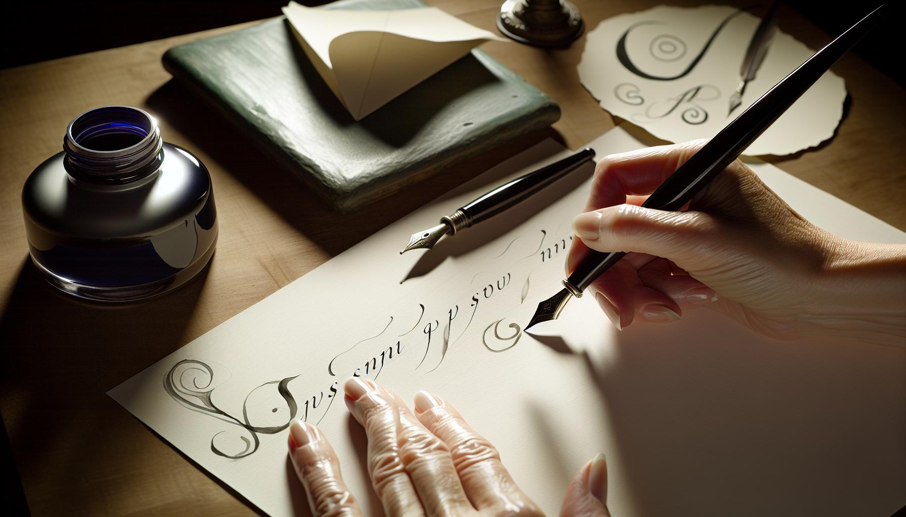
Fountain pen calligraphy merges the art of beautiful writing with the versatility and smoothness of a fountain pen. If you’re diving into this craft, you’re in for a treat. Understanding how a fountain pen functions is paramount. Unlike traditional pens, fountain pens use a nib that allows for a smooth flow of ink, creating variations in line thickness based on how much pressure you apply. This unique characteristic makes it easier to achieve expressive and artistic letterforms.
Getting comfortable with your pen is the first step. Make sure to familiarize yourself with different nib sizes-fine, medium, and broad-each offering distinct experiences. Many calligraphers prefer broader nibs for more dramatic strokes, while finer nibs are great for intricate details. It’s also essential to learn how to hold the pen correctly-aim for a relaxed grip that allows for fluid movement without straining your hand.
You should also consider the type of paper you’ll be using. Not all paper is created equal when it comes to fountain pen ink. Look for smooth, bleed-resistant paper that can handle the ink without feathering, allowing your strokes to maintain clarity and precision. As you practice, pay attention to how the ink flows-it should glide effortlessly across the surface.
Finally, remember that practice is key to mastering fountain pen calligraphy. Start with simple exercises to develop muscle memory before moving on to complex letterforms. Don’t shy away from experimenting with different styles and techniques; this journey is as much about exploration and self-expression as it is about developing skill. The beauty of fountain pen calligraphy lies in its ability to turn your handwriting into art, so embrace the process!
Choosing the Right Fountain Pen for Calligraphy
Choosing the right fountain pen is crucial for creating beautiful calligraphy. Not all pens are created equal, and the choice you make can drastically affect your results. You’ll want a pen that not only feels good in your hand but also offers the functionality you need for fluid writing and artistic expression. When you’re navigating the options out there, consider these key factors to find the perfect pen for your calligraphy journey.
First, let’s talk nib sizes. Fountain pens come with a variety of nib sizes, typically ranging from extra fine to broad. Each nib size has its unique characteristics-fine nibs are excellent for intricate details and smaller letters, while broad nibs allow for bold strokes and dramatic flourishes. Many calligraphers prefer medium or broad nibs for the versatility they offer in creating varied line widths. My personal recommendation? Try a couple of different sizes to see how they feel in your hand and how they perform on your chosen paper.
Next, don’t overlook the material of the nib. Gold nibs tend to provide a smoother writing experience and more flex, which can be advantageous for calligraphy, allowing for expressive line variation. Stainless steel nibs are often more affordable and can still perform beautifully, especially for those just starting out. It’s worth visiting a store where you can test out different pens to see how each nib responds to your pressure and movement.
Another essential aspect is the feed mechanism. Some fountain pens feature a cartridge system, while others use converters that allow you to draw ink from a bottle. Converters give you the freedom to experiment with a broader range of inks, which can significantly enhance your calligraphy. If you’re serious about your craft, investing in a pen that uses a converter could pay off in the long run.
Finally, consider the overall comfort and balance of the pen. A comfortable grip and weight distribution can make all the difference, especially during long writing sessions. Look for pens that feel substantial but not heavy, and ensure the grip suits your writing style. Remember, the goal is to have a tool that feels like an extension of your hand, allowing you to focus on creating beautiful letters without unnecessary strain.
In summary, is about finding the right nib size, material, feeding mechanism, and comfort. Don’t rush this decision; spend time testing pens and exploring what feels best for you. With the right pen in hand, you’ll be well on your way to crafting elegant letters that delight and inspire.
Essential Inks for Smooth Calligraphy Flow
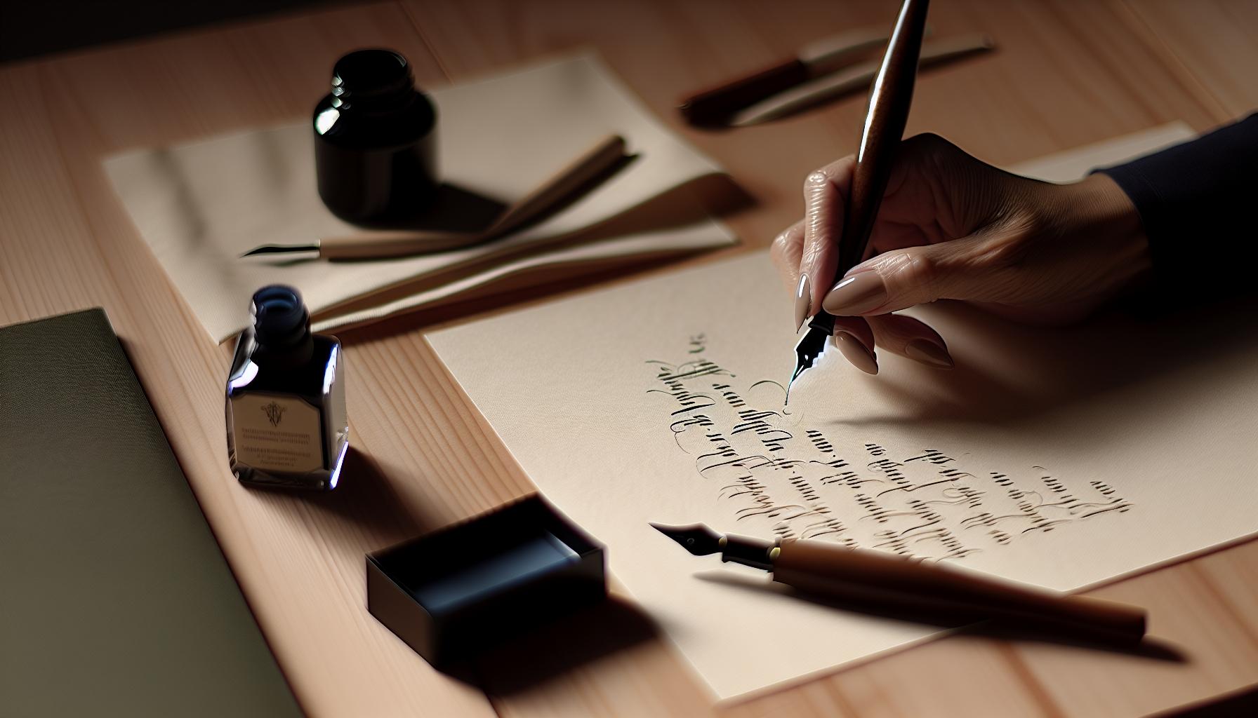
When it comes to creating stunning calligraphy, the ink you choose plays a pivotal role in achieving smooth, beautiful results. The right ink not only enhances the overall look of your letters but also influences how your pen interacts with the paper, allowing you to perform those elegant strokes with ease. Understanding the characteristics of various inks will empower you to make choices that enhance your calligraphy practice.
First off, let’s discuss viscosity and flow. Inks designed specifically for fountain pens typically have the right consistency to flow smoothly without causing skips or blobs. Look for inks labeled as “fountain pen friendly,” as these are formulated to minimize clogging and ensure a consistent line. Brands like Pilot Iroshizuku, Noodler’s, and Robert Oster offer a range of colors and properties that can suit different styles and preferences. In my experience, inks that flow well can make the process of writing feel like gliding across the paper, which is essential for calligraphy where precision and control are key.
Additionally, consider the drying time of the ink. If you tend to move your hand quickly across the page or if you’re working on a project like a card or an invitation that may get smudged, opt for fast-drying inks. These will help prevent smearing-especially if you’re using softer paper or are prone to overworking your letters. For example, many artists prefer water-based inks that dry quickly and resist smudging, which is invaluable during longer writing sessions.
Color saturation is another important factor. You want to select inks that produce vibrant, rich colors that pop on the page. Some inks, particularly those from the Eternal or Schmidt lines, provide a stunning range of hues with excellent lightfastness. This means that not only do they look good while you’re writing, but they’ll also remain beautiful over time without fading. Brilliant colors can really elevate the visual impact of your calligraphy and keep your work looking fresh.
Finally, remember to test your ink on the paper you’ll be using. Different inks can behave differently depending on the paper’s texture and absorbency. Use sample swatches to see how each ink flows, dries, and interacts with various papers. A simple test can save you frustration down the line and help you achieve results you truly love. By being mindful of these factors, you can select the inks that will not only meet your needs but also delight you with every stroke as you bring your calligraphy to life.
Mastering Calligraphy Techniques: Strokes That Wow
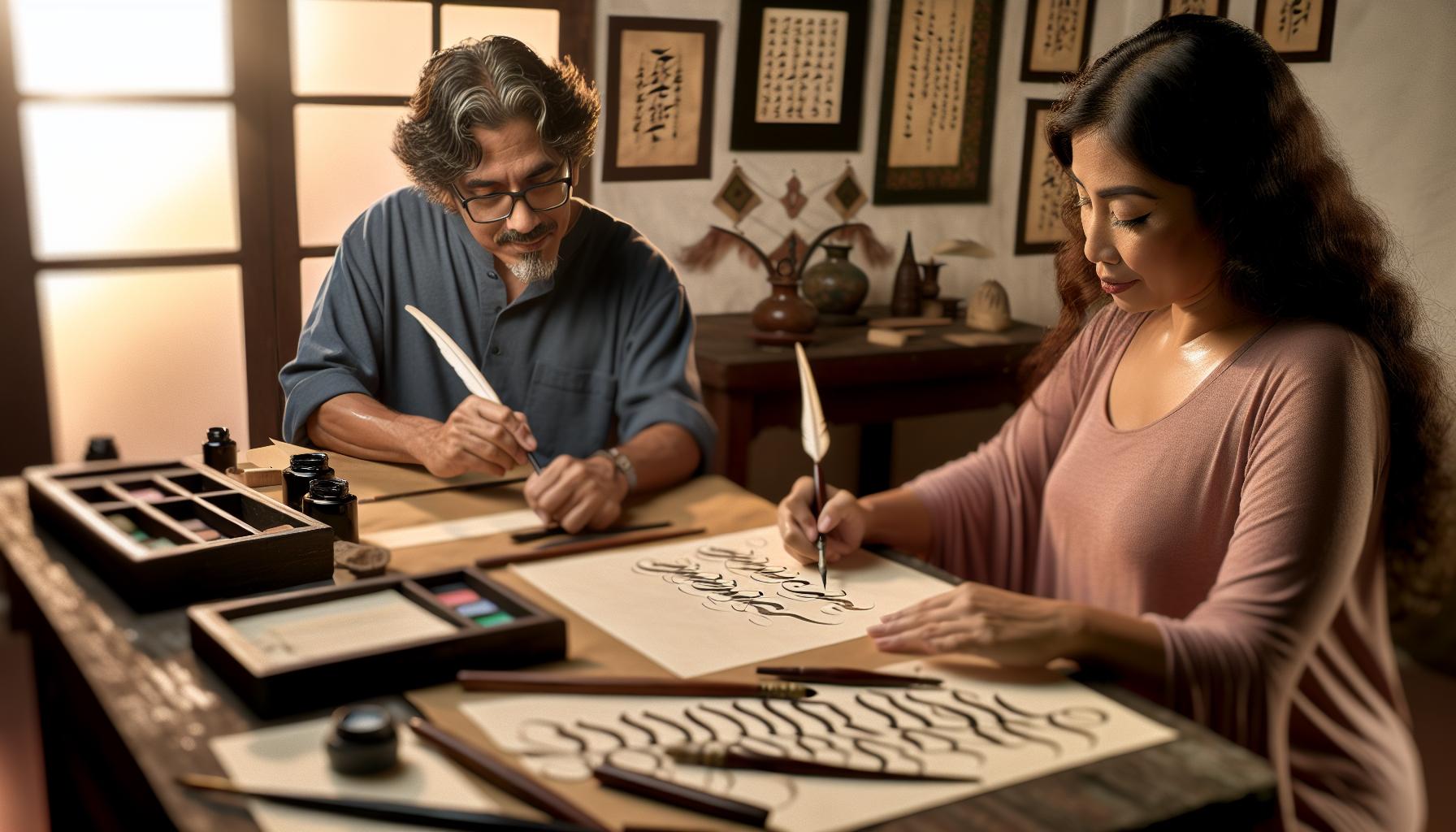
Every time you pick up a fountain pen, you have the potential to create something truly stunning. It’s not just about the ink that flows from your pen; it’s how you wield that pen to craft each letter and flourish. Mastering the strokes in calligraphy can turn simple letters into works of art that capture attention and admiration.
To start, focus on the fundamental strokes. These are the building blocks of your lettering and include basic shapes like upstrokes, downstrokes, and curves. Practicing these strokes repeatedly will significantly improve your control and muscle memory. Try setting aside a few minutes each day to practice these fundamental movements-smooth lines and consistent pressure will come with time. As you master these basic strokes, you’ll notice a considerable lift in the overall beauty and elegance of your letters.
Creating Variation
Tips to elevate your strokes include playing with pressure and angle. Press down harder for thicker lines and lighten up for delicate, thin lines. This contrast brings life to your letters, making them visually dynamic. Experiment with different angles of your pen nib. A 45-degree angle can yield beautifully thick downstrokes, while sharper angles can create fine, elegant details. Don’t shy away from trying various hand positions, either; what feels natural for you may lead to a unique style that differentiates your work.
Coordinating Movement
Fluid motion is key. Think of each stroke as a dance, where each movement leads naturally to the next. An effective way to develop this fluidity is to practice letters in pairs, focusing on how you transition between them. For instance, writing the letter “o” followed by a “d” allows you to practice a smooth connection. Significantly, keep your wrist relaxed. Tension can lead to shaky lines and fatigue. Instead, let your entire arm guide the letter formation, allowing for broader, more graceful movements.
Incorporating these techniques into your routine will not only add flair to your handwriting but also enhance your enjoyment of the process. Calligraphy is an art, and like any art, it flourishes with practice and passion. So grab your fountain pen, dedicate some time to mastering those strokes, and let your creativity flow!
Letterforms 101: Crafting Elegant Letters
Crafting elegant letters in calligraphy is all about precision and practice. It’s not just an art form; it’s a method of expression that combines style and technique. Every letter you create can evoke feelings, convey messages, or serve as a beautiful accent to any project. Let’s dive into the essentials of letterforms and how you can elevate your penmanship.
Begin with the fundamentals of letter structure. Each character has a unique anatomy that dictates how it flows and reads. Focus on key components: ascenders, descenders, stems, and bowls. Familiarize yourself with how these parts interact to create cohesion within each letter. Spend time drawing each component separately before combining them into complete letters. This approach gives you the clarity needed to construct elegant forms.
Next, experiment with spacing and alignment. Pay attention to how letters sit in relation to one another. Consistent spacing creates rhythm, while varied spacing can draw attention to specific elements. Use guidelines to keep your lines straight. Start with a grid on your practice sheets, adjusting as you go. Perfect spacing reinforces the elegance of your work and enhances its overall presentation.
Proficiency in proportions is essential. Different styles require unique proportions-think of how modern calligraphy can differ vastly from Gothic or Copperplate. Practice drawing each letter in isolation, focusing on its height, width, and overall shape. Once you feel comfortable, begin to connect letters to form words, paying close attention to how they interact visually. The goal is to create a seamless flow that’s both harmonious and aesthetically pleasing.
Finally, add flair with personal touches. Once the basics are second nature, infuse your letters with unique twists-like unconventional angles or unexpected flourishes. This is where your personality comes through! Flourishes can enhance your letters but should not overpower them. Use them judiciously to maintain clarity while adding elegance.
Incorporating these techniques into your daily practice will enhance your calligraphy and make each letter you write a piece of art. Take your time, celebrate your progress, and let your creativity shine through each stroke. The beauty of calligraphy is that it’s a journey of personal growth-enjoy every step!
Creating Dynamic Flourishes to Elevate Your Work
Creating elegant flourishes can transform your calligraphy from simple letters into exquisite pieces of art. Flourishes add a personal touch and elevate your overall composition, allowing your unique style to shine through. They can range from subtle embellishments to bold statements that capture the viewer’s attention. Start by practicing basic flourishes in isolation; this foundational work is essential before integrating them into your letters.
Experiment with Flourishing Techniques
Begin by incorporating different types of flourishes, like loops, swirls, and tails. Each flourish has its own character and can convey various emotions or styles. For example, a delicate loop may suggest refinement, while a dramatic swoosh can impart energy. Here are a few techniques to consider:
- Basic Loops: Start by drawing a loop at the beginning or end of a letter. It can give a graceful entry or exit to your words.
- Trailing Tails: Extend the tail of letters like “y” or “g” into an elegant flourish that curls back on itself.
- Swirling Strokes: Experiment with integrating swirling motions that add a dynamic feel to your script. This can work especially well in larger lettering or headings.
Practice each one slowly to gain comfort with your pen’s movement and control. Use lighter pressure during the initial strokes of flourishes and gradually increase it for the darker, more pronounced lines. This contrast will help create a more visually interesting piece.
Know When to Use Flourishes
While flourishes can enhance your work, moderation is key. Use them to accentuate important parts of your text, but don’t let them overwhelm your letters. For instance, you might choose to flourish the initial letter of a name or a particularly significant word, rather than cluttering an entire sentence. This strategic use of flourishes maintains readability while still showcasing your artistic flair.
To help visualize these techniques, consider sketching out a few samples on practice paper. This experimentation will allow you to find your personal style and the right balance of flourishes that suit your handwriting. As you develop your skills, you’ll find that these touches will not only make your calligraphy stand out but also bring joy to your creative process.
Common Mistakes in Fountain Pen Calligraphy to Avoid
One common pitfall in fountain pen calligraphy is neglecting proper grip and hand position. If your fingers are too tight or improperly placed on the pen, you’ll struggle to achieve fluid motion and consistent ink flow. A relaxed grip allows for better control and precision. Experiment with different grips until you find one that feels comfortable and natural. Remember, your hand should move smoothly, almost as if it’s dancing over the paper.
Another frequent mistake is failing to test your ink and nib combination before diving into a project. Not all inks behave the same, and certain nibs will yield varying results depending on the ink viscosity. Spend some time testing your materials on scrap paper to get a feel for how they flow together. This way, you can avoid unpleasant surprises, like ink skipping or feathering, which can ruin your beautifully crafted letters.
Maintaining consistent pressure on the nib is essential. Newbies often apply too much force, which can lead to heavy lines and uneven ink output. Instead, aim for a light touch, letting the nib glide across the surface. With practice, you’ll develop the perfect pressure needed for varying line thickness, resulting in an elegant and professional look.
Lastly, don’t overlook the importance of practice. Many aspiring calligraphers expect immediate perfection, but mastery takes time and repetition. Set aside dedicated practice periods where you focus on individual letters, connecting strokes, or even full words. The more you practice, the more confident you’ll become, allowing your unique style to flourish. If you can dodge these common errors, you’ll set yourself on the path to creating stunning calligraphy with your fountain pen.
Practicing Calligraphy: Tips for Consistency and Speed
To truly elevate your fountain pen calligraphy, cultivating consistency and speed in your practice is crucial. It’s often said that practice makes perfect, and in the realm of calligraphy, this couldn’t be more accurate. Regular practice not only reinforces muscle memory but also helps you glance down at the page with confidence, knowing you can replicate those elegant strokes you’ve honed over time.
Start by establishing a daily practice routine. Even short, focused sessions of 15-30 minutes can significantly enhance your skill. During these times, zero in on specific aspects of your writing. For instance, focus on letterforms one day and dynamic flourishes the next. This targeted approach prevents overwhelm and helps you build a strong foundation. Use lined practice sheets to maintain consistent letter height and spacing, which are vital in creating visually appealing work.
While practicing, make sure you’re tracking your progress. Consider creating a dedicated journal for your calligraphy evolution. Take note of what works, what feels challenging, and any particular strokes that you want to perfect. This tangible record not only documents your journey but also motivates you to keep improving. Additionally, don’t shy away from experimenting with different pens and inks. Sometimes, a slight change in nib size or ink flow can make all the difference, allowing you to explore various styles and achieve the efficiency you desire.
Lastly, remember that speed comes with confidence. As you become more comfortable with your strokes, your hand movements will feel more fluid and less hesitant. Focus on maintaining a relaxed grip; tension will hinder your speed and flow. Aim for a state of ‘flow’ where your hand naturally follows the rhythm of your writing. As you gradually build your speed, you may even discover new stylistic nuances in your calligraphy, making it not just a task, but a creative and enjoyable process.
Incorporating Style: Different Calligraphy Fonts Explained
Choosing the right calligraphy font can transform your work from ordinary to extraordinary. Each style carries its own personality, setting the tone for everything from formal invitations to casual notes. With so many options available, it’s essential to explore different fonts and find the one that resonates with your unique artistic voice.
When considering calligraphy fonts, here are some popular styles you might want to explore:
- Modern Calligraphy: This playful and free-flowing style combines traditional elements with a contemporary twist. It’s perfect for personal projects and adds a whimsical touch to any piece.
- Copperplate: Known for its elegance, Copperplate features thin upstrokes and thick downstrokes. It’s ideal for formal invitations, diplomas, and lettering that aims to convey refinement.
- Brush Script: This font mimics the strokes of a brush, creating a casual and friendly vibe. Great for personal notes or projects that require a more relaxed approach, it’s also highly adaptable to digital formats.
- Gothic or Blackletter: Rich in history, this dramatic style is characterized by its intricate and ornate letters. It’s fantastic for medieval-themed projects or anything that evokes a sense of the past.
- Italic: With its slanted letters, Italic is an accessible yet stylish font that combines beauty with readability. It’s suitable for a range of applications, from everyday writing to art pieces.
Integrating these styles into your work isn’t just about aesthetics; it can also enhance the message you want to convey. For instance, if you’re crafting a wedding invitation, pairing a more traditional font like Copperplate with a modern script can create contrast and draw attention to key details. Always consider the context of your work-choosing a font that aligns with your project and audience can make all the difference in the impact of your calligraphy.
Lastly, don’t hesitate to mix and match fonts to suit your creativity. However, keep balance in mind: pairing a decorative font with a simpler one can help maintain legibility while still showcasing your flair. Practice different combinations in your lettering exercises and see what resonates with you. You’ll find that experimenting with various styles not only enhances your skills but also deepens your understanding of calligraphy as an art form.
Showcasing Your Calligraphy: Creative Project Ideas
There’s something truly satisfying about completing a calligraphy project that not only showcases your skills but also serves a meaningful purpose. Whether it’s a handmade card or a beautifully addressed envelope, each piece reflects your personality and artistic flair. Here are some creative project ideas to inspire you to dive into showcasing your calligraphy talents.
One of the simplest yet impactful ways to highlight your calligraphy is through personalized greeting cards. You can create custom designs for birthdays, anniversaries, or thank you notes. Handwritten messages in elegant scripts elevate the sentiment, making recipients feel special. Consider experimenting with different styles, such as blending modern and traditional fonts, to add a personal touch.
Another fantastic project is creating wall art. Frame your calligraphy as beautiful artwork that can serve as decor for your home or gifts for loved ones. Inspirational quotes, meaningful phrases, or even your favorite song lyrics can be transformed into stunning pieces by playing with lettering sizes and flourishes. Use high-quality paper and vibrant inks to enhance the visual impact.
Don’t forget about the power of personalized stationery. Design a bespoke set using your calligraphy skills, adding your name or initials to finely crafted paper. This can be a delightful way to stay in touch with friends or send out invitations for special occasions. It’s a great project that combines practicality with an artistic touch, perfectly showcasing your talent in every letter.
Lastly, consider making place cards for dinner parties or events. Not only do they help organize seating arrangements, but beautifully written names can make guests feel welcomed and valued. This project allows you to mix creativity with functionality, leaving a lasting impression at any gathering.
These project ideas are just the beginning. The key is to let your imagination flow and choose projects that resonate with your style and the messages you want to convey. Each piece you create adds to your journey in calligraphy and helps you express yourself uniquely.
Maintenance and Care for Your Fountain Pen
To keep your fountain pen in top shape, regular maintenance and care are essential. A well-cared-for pen not only enhances your calligraphy experience but also prolongs the lifespan of your tool. For instance, cleaning your pen after every few uses is crucial, especially if you’re switching between different inks. Dried ink can clog the nib and feed, leading to inconsistent ink flow. To clean it, simply flush the nib with cool water, using a bulb syringe if needed, until the water runs clear. If you’ve been using a pigmented or shimmer ink, consider a deeper cleaning with a mild pen cleaner.
Storing Your Fountain Pen effectively is another key aspect of maintenance. Always keep your pen capped when not in use to prevent the nib from drying out. If you’re storing it for an extended period, consider removing the ink cartridge or converter. This helps maintain a safe environment for your pen and prevents any potential leaks. For best results, store the pen horizontally to ensure even ink distribution, which can help in maintaining a smooth flow when you return to writing.
Remember, the type of ink you use can also impact your pen’s performance. Always opt for high-quality fountain pen inks that are designed for your specific pen type. Cheaper inks can contain particles that may clog your nib. When you find a brand you like, stick with it! Regularly inspect the nib for any wear or damage, and if you notice any cracks or bends, consult a professional for repair.
By taking these simple steps – cleaning often, storing properly, and choosing your ink wisely – you’ll ensure your fountain pen stays functional and your calligraphy remains a joy rather than a chore. The effort you put into maintenance pays off with elegant, consistent lettering that reflects your hard work and creativity.
Resources to Enhance Your Calligraphy Skills
Finding the right resources can make all the difference in honing your calligraphy skills. The beauty of calligraphy isn’t just in the final product; it’s in the journey, the learning, and the practice. To elevate your game, consider tapping into a mix of online platforms, books, and community resources that can offer guidance, tips, and inspiration.
Start with video tutorials on platforms like YouTube, where seasoned calligraphers share their techniques. Channels such as “The Postman’s Knock” and “Calligraphy Masters” offer step-by-step guides that break down complex strokes into manageable parts. Watching skilled calligraphers in action not only helps with technique but can also spark your creativity.
Don’t overlook the power of books. Look for titles like “The Art of Calligraphy” by David Harris or “Mastering Copperplate Calligraphy” by Eleanor Winters. These books often come packed with foundational skills, exercises, and historical context that deepen your understanding. They provide not just instructions but also insights into the art form itself.
Joining a local or online community can be incredibly beneficial. Websites like Instagram or Facebook host groups where calligraphers share their work, challenges, and triumphs. Finding a mentor or fellow enthusiasts can provide motivation and constructive feedback. Participating in challenges or collaborative projects gives you real-world deadlines to practice and improve your skills.
Utilize practice sheets available for free or purchase from various calligraphy websites. Sheets catering to different styles help reinforce letterforms and spacing. Apps that simulate calligraphy tools can also be fun ways to practice if you’re looking for something digital.
To truly enhance your skills, immerse yourself in the community and resources available. Engage actively, ask questions, and don’t be afraid to experiment. With the right tools and support, your calligraphy will flourish beautifully.
Q&A
Q: What is the best way to practice calligraphy with a fountain pen?
A: The best way to practice calligraphy with a fountain pen is to set aside dedicated time for consistent practice. Start with basic strokes and gradually move to letterforms. Use grid paper to maintain consistent size and spacing, and consider using a practice workbook focused on calligraphy to enhance your skills effectively.
Q: How do I choose the right ink for fountain pen calligraphy?
A: Choosing the right ink for fountain pen calligraphy involves considering flow and drying time. Look for inks marketed as “calligraphy-friendly” that offer smooth flow without clogging. Test different brands to find one that provides the desired shading and vibrancy for your elegant letters.
Q: What are common mistakes beginners make in fountain pen calligraphy?
A: Common mistakes include applying too much pressure on the nib, inconsistent letter spacing, and not maintaining a steady hand. To avoid these, practice light pressure, use guides for spacing, and focus on slow, deliberate movements to build muscle memory and confidence.
Q: Can I use any fountain pen for calligraphy, or are there specific types?
A: Not all fountain pens are suitable for calligraphy. Ideal calligraphy pens typically have flexible nibs designed for varied line thickness. Consider using pens specifically labeled for calligraphy to achieve the desired results and enhance your writing experience.
Q: How can I improve my calligraphy speed without sacrificing quality?
A: To improve your calligraphy speed, focus on mastering fundamental strokes first. Gradually increase your speed as you become more comfortable with the movements. Regular practice combined with timed drills can help balance speed and quality in your letters.
Q: Why is consistent practice important in learning fountain pen calligraphy?
A: Consistent practice is crucial because it builds muscle memory, improves control, and enhances your overall skill level. Even short daily sessions can significantly impact your progress over time, allowing you to create elegant letters more effortlessly.
Q: What are some creative project ideas to showcase my calligraphy skills?
A: Some creative project ideas include designing personalized greeting cards, creating wall art with inspirational quotes, or making custom invitations for events. These projects allow you to apply your skills while showcasing your unique style and flair in calligraphy.
Q: How should I maintain my fountain pen for optimal calligraphy performance?
A: To maintain your fountain pen, regularly clean the nib and feed to prevent ink buildup. Use the right cleaning solution and avoid using abrasive materials. Proper storage and occasional ink flushing will enhance performance and longevity, allowing for smoother writing experiences.
In Conclusion
Now that you’re equipped with the essentials for writing beautiful calligraphy with a fountain pen, it’s time to put your skills into practice! Remember, the key to elegant letters lies in patience and persistence. Don’t rush through; enjoy the process of creating your own artistic style. If you want to take your calligraphy skills further, check out our tutorials on mastering different styles or dive into advanced techniques that will truly make your work stand out.
Don’t forget to share your progress with us! We’d love to see your creations, and engaging with fellow calligraphy enthusiasts can spark new ideas and improve your craft. And if you haven’t already, subscribe to our newsletter for exclusive tips, resources, and inspiration delivered straight to your inbox.
Keep exploring the art of calligraphy, and discover how it can enrich your personal notes, invitations, or even your daily journaling. Your fountain pen is just the beginning-let your creativity flow!