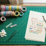

Have you ever marveled at the graceful curves of beautifully penned letters? Writing calligraphy with a brush pen isn’t just an art form; it’s a powerful way to express your personality and creativity. Whether you’re looking to create stunning invitations or personalize gifts, mastering brush pen calligraphy opens a world of artistic expression and connection.
In this guide, you’ll discover the essential techniques to craft elegant letters that captivate and inspire. We’ll tackle common challenges, from choosing the right brush pen to perfecting your strokes. You don’t need to be an expert to start; just a willingness to practice and play! By the end of this article, you’ll be eager to pick up your brush pen and start forming beautiful words that truly reflect your unique style. Let’s dive in and unlock the secrets of calligraphy together!
Choosing the Right Brush Pen for Calligraphy
When it comes to brush pen calligraphy, the right pen can make all the difference. Not all brush pens are created equal, and selecting one that aligns with your style and needs is crucial for achieving beautiful results. Factors such as nib flexibility, ink type, and pen grip can significantly impact your writing experience.
Start by considering the nib. Brush pens come with either flexible or firm nibs. Flexible nibs allow for more dramatic thick and thin strokes, ideal for expressive calligraphy. On the other hand, firm nibs provide more control and consistency for beginners or those who prefer a cleaner look. If you’re just starting out, a pen with a moderate flexibility can help you develop your skills without overwhelming you.
Next, look at the ink type. Water-based inks are popular for their vibrant colors and smooth flow but can be prone to smudging if not dry. Pigment-based inks are waterproof and fade-resistant, making them a good choice for projects that will be exposed to light or moisture. Each type has its strengths, so think about where and how you’ll use your calligraphy.
Another key element is the grip. A comfortable grip can reduce fatigue during long writing sessions, improving your performance. Some brushes feature ergonomic designs that fit snugly in your hand, while others may have a more traditional structure. It’s worth testing a few options to see which feels best for you.
Ultimately, the best brush pen for calligraphy is the one that fits your unique style and preferences. Don’t hesitate to experiment with different types until you find your perfect match. Whether you’re aiming for intricate designs or simple elegant letters, having the right brush pen will elevate your calligraphic journey.
Essential Techniques for Beautiful Brush Strokes

To create beautiful brush strokes, you must tap into the soul of your pen and paper. Brush pen calligraphy isn’t just about following techniques-it’s about embracing a fluid dance of movement and relaxation. One fundamental technique is mastering pressure control. This means applying varying pressure on the nib to achieve those luscious thick and thin strokes. The key? When you’re moving downwards, press harder for a thicker line; lift slightly when moving upwards to create a delicate, thin stroke. This contrast is what gives your letters that professional, polished edge.
Equally important is your grip and hand positioning. Hold your brush pen at an angle, ideally around 45 degrees to the paper. This angle allows for better flow and control of the ink. Keep your wrist relaxed-tension will travel up your arm and affect your strokes. Instead of focusing solely on your fingers, think about moving your whole arm, especially for larger letters or flourishes.
Don’t shy away from practicing on different surfaces, too. Smooth, high-quality paper will help you create smoother strokes, whereas textured paper can produce a rougher, more organic look. Create a practice routine where you focus on tracing the same letters or words repeatedly. As you gain confidence, gradually introduce variations-experimenting with different weights or styles will not only enhance your skill but also infuse your work with personality.
Lastly, consistency is vital in brush strokes. Developing a rhythm in your movements helps maintain uniformity across your work. Try playing soft music or metered beats while you practice; the rhythm can guide your hand and enhance your flow. Remember, practice doesn’t just make perfect-it makes your style unique. Give yourself permission to explore, make mistakes, and most importantly, have fun with every stroke you lay down.
Building a Strong Foundation: Basic Alphabet Forms
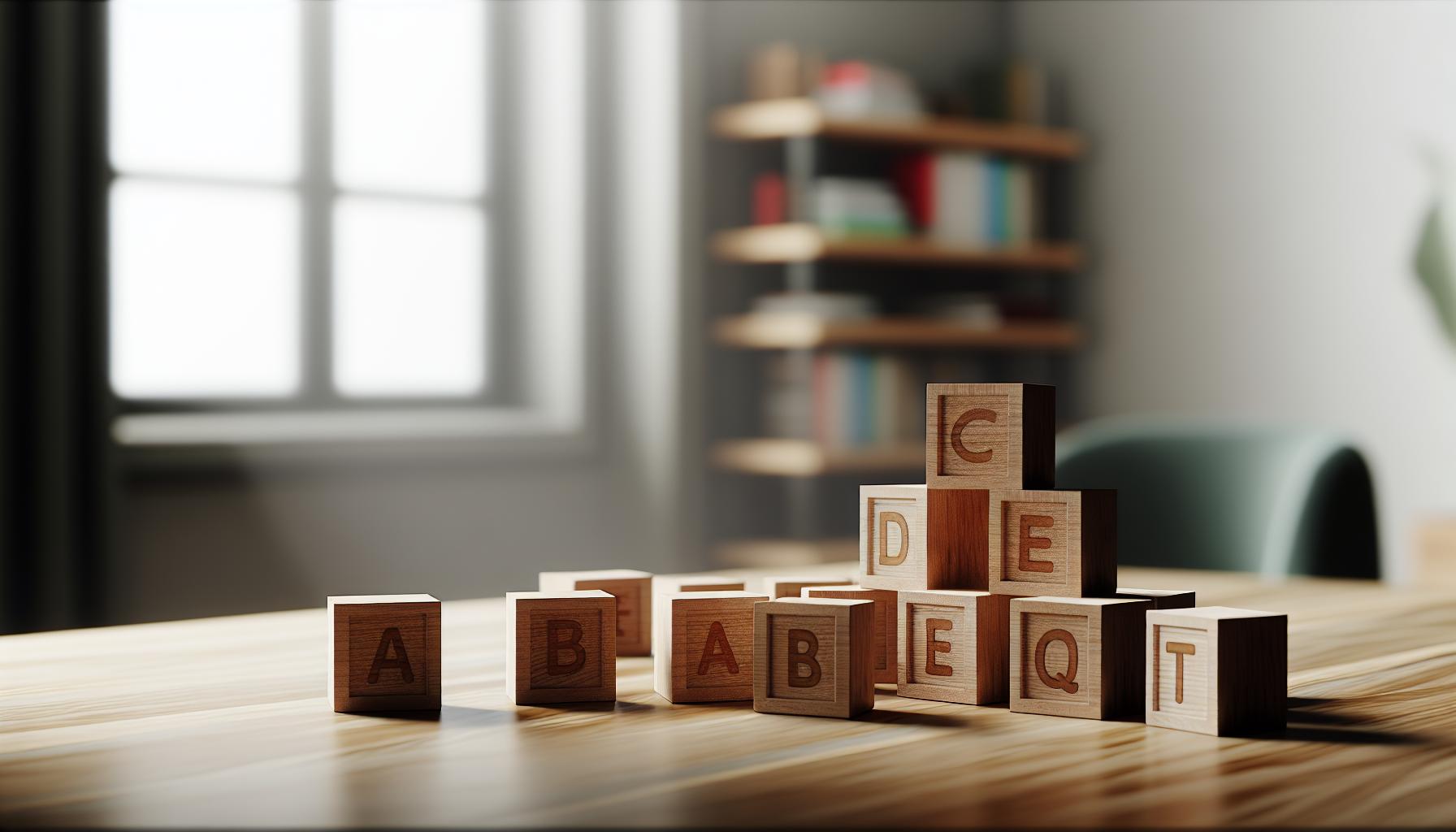
The first step in mastering brush pen calligraphy is building a solid foundation with basic alphabet forms, which directly impacts the elegance and readability of your work. Think of letters as shapes that you can manipulate; understanding their anatomy is crucial. Each letter has distinct characteristics, and recognizing the basic forms will empower you to create beautiful, consistent lettering.
When practicing your alphabet, focus on breaking each letter down into simple components. For instance, the letter “A” consists of two diagonal strokes and a crossbar-simple enough, right? Start by sketching these forms lightly; some people find it helpful to use a pencil before committing to ink, especially when learning a new style. As you grow more comfortable, transition to using your brush pen, applying the pressure techniques you’ve already practiced: press harder on downstrokes for thickness and ease up on upstrokes for that delicate finish.
Here are some key alphabet forms to practice:
- Straight Letters: Focus on the upright forms like “I”, “L”, and “T.” These offer a straightforward approach to control and uniformity.
- Curvy Letters: Letters like “C”, “G”, and “S” involve more fluid motions. Pay special attention to maintaining a consistent rhythm in your strokes.
- Looping Letters: Letters such as “b”, “d”, and “f” incorporate loops. Practicing these will enhance your understanding of how pressure can add elegance.
- Connected Letters: Once you’re comfortable with individual letters, practice linking them together, which is the essence of calligraphy.
Consistency is essential, but so is adaptability. Don’t just replicate; experiment with the styles of different calligraphers to develop your unique voice. Spend time each day practicing your basic forms. Set a timer for focused sessions and track your progress. Over time, you’ll find that these foundational forms will evolve into stunning, unique lettering styles that carry your personal touch. Remember, calligraphy is an art that thrives on practice, patience, and a willingness to explore beyond your comfort zone.
Mastering Flourishes and Embellishments
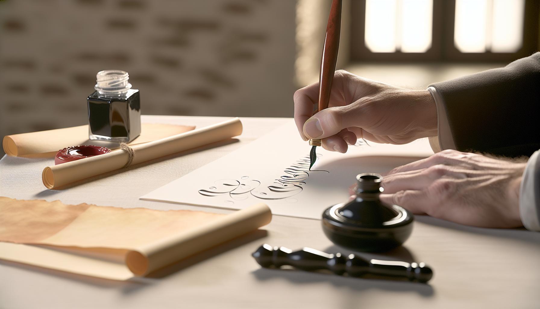
To elevate your brush pen calligraphy, is essential. These decorative touches can transform a simple letter into a stunning piece of art. Flourishes are not just for aesthetics; they add personality and character to your writing, making it feel unique and expressive. Instead of seeing flourishes as an afterthought, think of them as vital components that complement your lettering style.
Start by practicing basic flourishes that can be integrated easily into your letters. A great way to begin is by adding swirls and loops to the ends of your strokes. For example, when finishing the letter “f,” extend the tail and give it an elegant curve. This small addition can instantly elevate your work. Similarly, for letters with ascenders and descenders, like “h,” “k,” or “g,” try embedding delicate curls that flow gracefully from the letter’s structure.
Keep in mind that less is often more. Overdoing embellishments can detract from the overall clarity of your letters. Aim for balance: let some words be bold and adventurous while keeping others clean and simple. It’s helpful to sketch your flourishes lightly in pencil first. This approach allows you to experiment without the commitment of ink, ensuring that each flourish enhances rather than overwhelms the base letter.
As you get comfortable with basic flourishes, start exploring more elaborate designs. You can look to famous calligraphers for inspiration, studying how they integrate flourishes seamlessly into their styles. Whether you’re channeling an ornate Spencerian script or a more modern style, let your creativity shine through. And remember, practice is key-create a dedicated space where you can focus solely on flourishing and allow your unique voice to develop. Over time, you’ll find your signature flourishes that resonate with your personal style, making your calligraphy truly stand out.
Creating Stunning Letters: Tips and Tricks
When it comes to brush pen calligraphy, creating stunning letters is all about mastering your technique and finding your own unique style. Start with the basics: hold the pen correctly-this means maintaining a comfortable grip at an angle that allows you to use both the nib and the width of the brush effectively. Many artists swear by the 45-degree angle, which provides the best control and flow for brush strokes.
To enhance your letterforms, pay attention to pressure control. This technique is crucial in brush pen calligraphy; applying pressure on the downstrokes and lifting on the upstrokes not only creates dynamic contrast but brings your letters to life. Practice these strokes separately: try creating thin, delicate lines on the way up and bold, robust lines on the way down. This technique fosters a sense of rhythm and movement in your work, essential for adding character to your letters.
Another key tip is to experiment with spacing and letter connections. When forming words, think about how letters interact with one another. Do they embrace? Hug? Leave space? Experimentation can lead to stunning results. Moreover, consider incorporating various styles or fonts within the same piece; such juxtaposition can create a beautiful visual rhythm that keeps your audience engaged.
Lastly, don’t shy away from trial and error. If something doesn’t look right, see it as an opportunity to learn. Sometimes, the most beautiful creations emerge from mistakes. Use a practice pad to sketch out new letterforms, try layering colors, or incorporate small illustrations. The more you experiment, the more you’ll discover what makes your style uniquely yours. So, gather your tools, get comfortable, and let your brush pen dance across the page-the possibilities are endless!
Combining Colors for Unique Effects
There’s something magical about incorporating multiple colors into your brush lettering. When done right, color blending can elevate your calligraphy from basic to breathtaking. Start by choosing a color palette that speaks to you. Consider complementary colors-those opposite each other on the color wheel-like blue and orange, or you might prefer analogous colors, which sit next to each other, like teal and green. Creating a visual harmony with your color choices can profoundly impact the overall aesthetic of your work.
To effectively combine colors, consider using a technique called “ombre” or gradient blending. This involves blending two or three colors smoothly to create a gradual transition. Begin by applying one color to the tip of your brush and another color at the base. As you write, slightly overlap the two colors to blend them seamlessly. This not only produces a stunning effect but adds depth to your letters. For beginners, this technique might take some practice to master, but it’s well worth the effort.
Another approach is to layer colors for a more dynamic effect. Start with a base color for your letters, then use a finer brush to add highlights or shadows with a second color. For example, if you write “hello” in a solid pastel pink, adding a darker pink or even a contrasting color to the edges creates depth and makes your lettering pop off the page. Remember, less is often more; too many colors can overwhelm the reader, so aim for balance in your composition.
Don’t forget about the power of metallics or glitter inks! These can be used as accents to catch the light and draw attention. Try incorporating these into special projects like wedding invites or cards that require an extra touch of elegance. Always remember to practice on scrap paper first, as combining colors can yield different results depending on the paper and ink used. Through experimentation and creativity, you’ll find your own signature style that showcases your personality while delighting your audience.
Common Mistakes to Avoid in Brush Pen Calligraphy
There’s no shortage of joy in brush pen calligraphy, but even seasoned artists make avoidable mistakes that can muddy their beautiful lettering. One common pitfall is applying too much pressure when writing. Brush pens are designed to create varying line thicknesses with light pressure for upward strokes and a firm grip for downward strokes. Overdoing it can lead to frayed tips and inconsistent strokes. Practice light pressure on ascenders and hold the pen lightly to maintain fluidity; your strokes should feel effortless.
Another mistake is neglecting to practice on different paper types. Each paper interacts uniquely with different inks. For example, smooth papers help your brush glide beautifully, while textured papers can catch your nib, leading to uneven strokes. Invest in various types of paper to experiment, and always test your choices on some scrap before diving into your project. Finding the right combination will make a significant difference in the final effect of your lettering.
Many beginners also forget to consider their color choices, leading to muddled designs. Stick to a cohesive palette to avoid overwhelming your piece with clashing colors. It’s a great idea to create sample sheets with the colors you plan to use, so you can visualize how they blend and interact before committing to your lettering. Remember, the beauty of brush pen calligraphy often lies in simplicity and well-executed color theory.
Finally, impatience is a common barrier to improvement. When you’re eager to see results, it’s tempting to skip fundamental drills or rush through techniques like transitions and flourishes. Dedicate time to practice the basics regularly, and you’ll find that mastery over time brings more satisfaction than hastily completed projects. Mistakes are part of the journey, so embrace them, learn, and watch your skills flourish!
Inspiration: Famous Calligraphy Styles to Explore
Exploring famous calligraphy styles can ignite your creativity and inspire your own brush pen projects. Each style carries a unique history and artistic flair, allowing you to experiment and find a voice that resonates with you. From elegant scripts to bold modern designs, these styles can transform ordinary lettering into stunning art.
One of the most recognized styles is Copperplate, characterized by its sweeping curves and intricate flourishes. This style often utilizes a pointed nib and is celebrated for its elegance. If you’re looking to add a timeless touch to your work, practicing Copperplate will help you master the graceful transitions and line variations that define it.
Another compelling style is Modern Calligraphy, which blends traditional and contemporary techniques. This style is less rigid, empowering you to explore your own interpretation. You might find yourself breaking rules, experimenting with whimsical shapes, and incorporating playful elements. The beauty of modern calligraphy lies in its versatility; whether you’re crafting invitations or social media graphics, it invites creativity.
For a dramatic flair, consider Gothic calligraphy. This style features bold, angular letters that are striking and visually impactful. It’s perfect for headings, logos, or any project where you want to make a statement. Emphasizing thick downstrokes with thin upstrokes will give your letters that classic Gothic feel.
Lastly, don’t overlook Brush Script. This style mimics the free-flowing motions of brush pens, capturing the essence of spontaneity. Learning this style can help you to embrace fluidity in your strokes while allowing a more casual and accessible approach to lettering. It’s ideal for personal notes, art prints, and even digital designs.
By diving into these diverse styles, you can not only enhance your skills but also discover new ways to express yourself through brush pen calligraphy. Try each style and observe what elements resonate with you. The journey of exploration is just as rewarding as the final pieces you create.
Crafting Beautiful Quotes and Phrases
is one of the most rewarding aspects of brush pen calligraphy. It’s not just about writing; it’s about transforming words into elegant visual art that resonates with both the writer and the reader. When you start experimenting with quotes, choose those that inspire you or convey a message you find meaningful. This makes the process more personal and creatively fulfilling.
To create stunning quotes, consider the following tips:
- Pick a theme: Decide if your quote will evoke happiness, motivation, or introspection. A clear theme will guide your style choices and color palette.
- Plan your layout: Before putting pen to paper, sketch a rough layout. Think about how the words will flow across the page. Use varying sizes for different parts of the quote to draw attention to key phrases.
- Experiment with styles: This is your chance to integrate various calligraphy styles. Maybe a bold Gothic font for the main message, accompanied by a delicate script for the author’s name. Mixing styles adds visual interest.
- Incorporate design elements: Flourishes, borders, or even simple doodles can enhance your quote design. Don’t be afraid to add small decorative elements that complement the message.
- Practice, practice, practice: Your first attempt may not be perfect, and that’s okay! Keep practicing, iterating on designs after every trial. Each piece you create is a step toward refinement.
Also, consider the impact of colors in your work. Using complementary colors can create depth and highlight your quotes effectively. For example, pairing dark lettering against a light background can make the text pop, while using gradients within letters can give a sense of flow and movement.
Remember, it’s not just about the end product; it’s the journey of exploring different artistic expressions that makes crafting beautiful quotes truly special. Embrace the imperfections, enjoy the process, and watch as your unique style unfolds with every stroke of your brush pen.
Practicing Consistently: Exercises for Improvement
It’s no secret that consistency is key when it comes to mastering brush pen calligraphy. If you want to enhance your skills and transform your letters into art, dedicating time to practice is non-negotiable. Each stroke you make lays the groundwork for your growth, so dive into some effective exercises that will make a noticeable difference in your technique and confidence.
One excellent way to start is by incorporating warm-up exercises into your routine. These don’t have to be boring-after all, they’re the building blocks of better control. Try out these drills:
- Basic Strokes: Focus on repeating basic strokes like upstrokes, downstrokes, and arches. This helps you get comfortable with the pressure and release needed for dynamic letters.
- Letter Connections: Write the same letter in different styles and practice connecting them smoothly. This not only strengthens your hand coordination but also supports letter flow.
- Numbers and Symbols: Don’t just stick to letters. Practice numbers and symbols to add versatility to your calligraphy. These often have different angles and curves that can improve your overall skill.
Next, challenge yourself with timed exercises. Set a timer for five minutes and write as many letters or words as you can. This will push you to maintain fluidity without overthinking each stroke. You’ll be surprised at how much you can accomplish when you let go of perfection. Plus, tracking your progress over time can be incredibly motivating.
Remember to reflect on your practice sessions. After each session, take a moment to review what worked and where you could improve. Keeping a calligraphy journal can be invaluable for this process. Document your best pieces, note the strokes you struggled with, and include tips you’ve learned along the way. This not only helps reinforce your learning but also makes it easier to see your progress over time.
With these consistent practices, your brush pen calligraphy will steadily improve, allowing you to create stunning, personalized works of art. Embrace the journey, celebrate small victories, and don’t shy away from trying new techniques. Your skills will bloom with every stroke you practice!
Advanced Techniques: Blending and Shadowing
To elevate your brush pen calligraphy, mastering blending and shadowing techniques is a game changer. These methods not only enhance the visual depth of your letters but also add a unique personality to your work. It’s all about creating dimension that draws the viewer’s eye. The beauty of blending lies in seamlessly transitioning between colors, while shadowing adds that extra layer of realism, making your calligraphy pop off the page.
Start with blending. Choose two or more colors that complement each other well. For instance, a deep blue blended with a lighter sky blue creates a stunning gradient effect. To blend effectively, apply your base color first. Once it’s dry, layer the second color lightly at the edges where you want the gradient to begin. Use a damp brush pen or a water brush to gently mix the two colors together in small circular motions. This softens any harsh lines and creates a fluid transition. Remember, practice is key; don’t hesitate to experiment with different combinations to find what resonates with your style.
Now, let’s delve into shadowing. This technique adds depth by mimicking shadows that would naturally occur on your letters. Pick a light source – typically from the top left or top right of your lettering. Using a slightly darker shade of your base color, begin adding small strokes to the sides of your letters that would be cast in shadow. Keep your strokes light and varied in pressure to simulate the soft nature of a shadow. You can also use a finer brush pen for more precise detailing. The goal is to maintain a balance; too much can overwhelm your piece, while too little might not have the desired effect.
By integrating blending and shadowing, you’ll not only refine your lettering technique but also express your creativity in wonderful new ways. As you practice, you’ll find your own style evolve-allowing your calligraphy to truly stand out. So grab your brush pens and start playing; trust me, the results will be worth it!
Showcasing Your Calligraphy: Presentation Ideas
Showcasing your brush pen calligraphy can be just as important as the lettering itself. The way you present your beautiful words can elevate them from mere practice pieces to standout decor or heartfelt gifts. Whether it’s for a special occasion or just to add a personal touch to your home, having a clear vision for presentation can enhance the impact of your work.
Start by considering the medium you want to use. Framing your calligraphy can give it a polished look. Use a simple frame for minimalistic designs, or go for ornate frames if your work is more intricate. When framing, choose a mat that complements the colors in your lettering. This not only draws the eye but also protects your work from damage over time. If you’re feeling creative, consider using washi tape to adhere your calligraphy to a larger canvas or board; this can be particularly appealing for modern and informal settings.
Another option is to turn your calligraphy into functional art. Why not create greeting cards or gift tags? Handwritten notes with your calligraphy can add a personal touch that recipients will cherish. You can also make custom bookmarks; they’re practical and make great gifts for book lovers. Experiment with different paper types – textured, colored, or metallic – to add depth to your lettering.
Lastly, lighting plays a crucial role in how your calligraphy is perceived. If you’re displaying your work at an event or on a desk, ensure it’s well-lit. Natural light can enhance the colors and details of your work. If you’re showcasing it in a portfolio, consider using a scanner to convert it into digital format, allowing you to share your pieces online or create a stunning digital gallery.
Remember, your calligraphy deserves to be seen in its best light. With thoughtful presentation, you’ll ensure it makes the impression it deserves, inviting viewers to truly appreciate the effort and artistry behind every stroke.
Q&A
Q: What are the best practices for holding a brush pen for calligraphy?
A: To hold a brush pen effectively, grip it lightly between your thumb and index finger. Keep your wrist relaxed but stable, allowing the pen to move smoothly across the paper. Position the pen at a 45-degree angle to create optimal strokes. For detailed techniques, refer to the section on essential techniques for beautiful brush strokes.
Q: How long does it take to learn brush pen calligraphy?
A: The time to learn brush pen calligraphy varies, but with consistent practice, beginners can start creating recognizable letters within a few weeks. Mastering advanced flourishes and techniques may take several months, depending on individual dedication and practice frequency. Check out the practicing exercises section for tips.
Q: Can I use regular paper for brush pen calligraphy?
A: While you can use regular paper, it’s best to choose smooth and thicker paper designed for ink or brush pens to prevent bleeding and improve your strokes. Special calligraphy paper enhances the overall quality of your work. Refer to the article on presenting your calligraphy for material recommendations.
Q: What should I do if my brush pen is skipping while writing?
A: If your brush pen skips, try gently shaking it to release ink or re-dipping if it’s a dip pen. Ensure you’re applying consistent pressure and angle while writing. If the problem persists, check if the nib is damaged or needs cleaning. Explore common mistakes to avoid for better writing experiences.
Q: How can I add colors to my brush pen calligraphy?
A: You can blend different ink colors while writing with your brush pen, or use colored pens for effect. Layering colors creates depth; first write a base layer and let it dry, then add details in a contrasting hue. For more tips, dive into the section about combining colors for unique effects.
Q: What are the common mistakes to avoid when starting brush pen calligraphy?
A: Beginners often rush their strokes, use too much pressure, or fail to practice consistently. Avoid these pitfalls by focusing on slow and controlled movements, practicing regularly, and ensuring your tools are in good condition. Check out the common mistakes to avoid section for more insights.
Q: How can I find inspiration for calligraphy projects?
A: Inspiration can be found online through social media platforms like Instagram and Pinterest, where many calligraphers share their work. Books on calligraphy styles and forums can also spark ideas. See the inspiration section of the article for famous styles to explore.
Q: Are there online resources or communities for brush pen calligraphy?
A: Yes, many online communities offer support and resources for brush pen calligraphy enthusiasts. Websites, forums, and social media groups provide tutorials, feedback on your work, and inspiration from fellow calligraphers. Engaging in these communities can significantly enhance your skills.
Concluding Remarks
Now that you’re equipped with the skills to create stunning calligraphy letters using a brush pen, it’s time to put that knowledge into practice! Remember, each stroke is an opportunity to express your unique style. Don’t hesitate to explore our additional resources on calligraphy techniques and brush pen tips to enhance your practice even further.
If you enjoyed this guide, consider subscribing to our newsletter for more expert insights and tutorials. Your journey into beautiful writing doesn’t stop here-dive deeper with our related content on crafting your own fonts with Calligraphr, which can add a personalized touch to all your projects.
We’d love to hear about your experiences or any challenges you face while practicing! Share your thoughts in the comments below. Your feedback not only helps us improve but also fosters a supportive community of fellow calligraphers. Keep creating and remember: every stroke counts!
Get our latest guides, news, and insights highlighted in your Google Search & AI Overviews.