
Have you ever admired beautifully lettered quotes on social media or seen stunning invitations and wondered how to create that magic yourself? Faux calligraphy is a fantastic way to achieve gorgeous lettering without needing fancy tools or years of practice. This accessible technique can transform everyday writing into something special, whether it’s addressing envelopes or crafting personalised gifts. In this guide, we’ll break down the easy steps to get you started, so you can impress friends and family with your newfound skills. Get ready to dive into the world of faux calligraphy-it’s simpler than you think, and the results are truly rewarding!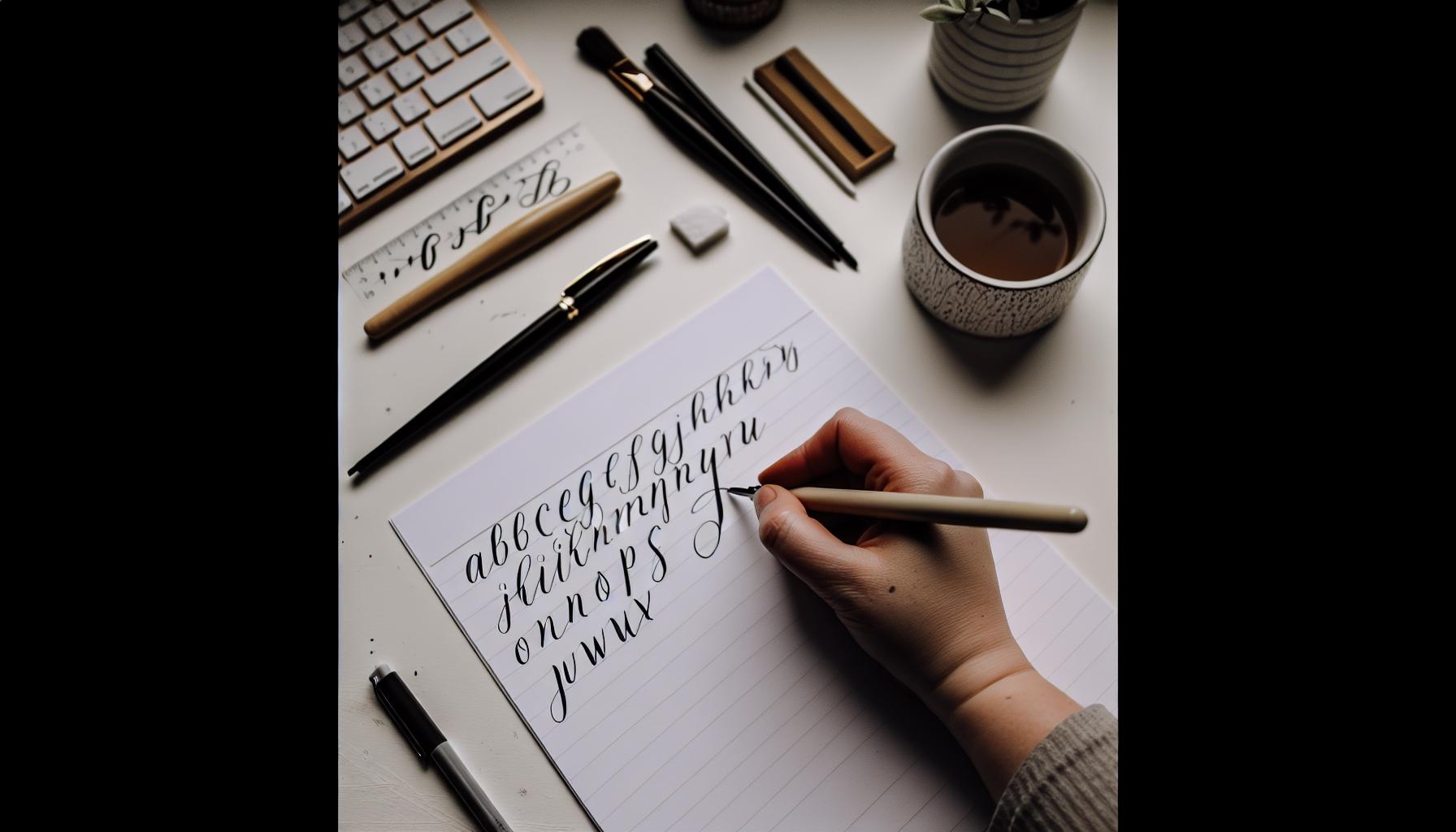
Getting Started with Faux Calligraphy Techniques
Starting your journey into faux calligraphy can be both exciting and intimidating, but understanding the essential techniques will set you on the right path to creating stunning letters. Faux calligraphy is an accessible way to achieve the elegant look of traditional calligraphy without needing specialized tools or years of practice. The beauty of faux calligraphy lies in its simplicity and flexibility, allowing you to express your creativity with just a pen and some paper.
To begin, one of the key techniques is mastering the concept of thick and thin strokes. As you write each letter, imagine how a calligrapher would create variations in line weight. You can create the illusion of elegant strokes by applying pressure on the downstrokes and lifting your pen on the upstrokes. Don’t worry if it feels awkward at first; with practice, it will become second nature. Grab a simple ballpoint pen or a gel pen-you don’t need fancy tools to start!
Next, focus on the letterforms themselves. Start with basic letters, such as ‘a’, ‘e’, and ‘o’, and experiment with adding those faux thick and thin lines. Practice creating different styles by adjusting how dramatically you vary your stroke weight. Keep a notebook dedicated to faux calligraphy; doodling and repetition will help you build muscle memory. As you refine your skills, try incorporating some basic flourishes-little embellishments that can take your writing from ordinary to extraordinary.
Finally, remember to be patient and enjoy the process. Faux calligraphy is all about personal expression, so embrace your unique style as you progress. Sharing your results, whether it’s on social media or in a personal journal, can help boost your confidence and keep you motivated. This journey will allow you to develop a distinctive flair that reflects your personality while enjoying the meditative aspects of lettering. Dive in, have fun, and let your creativity flow!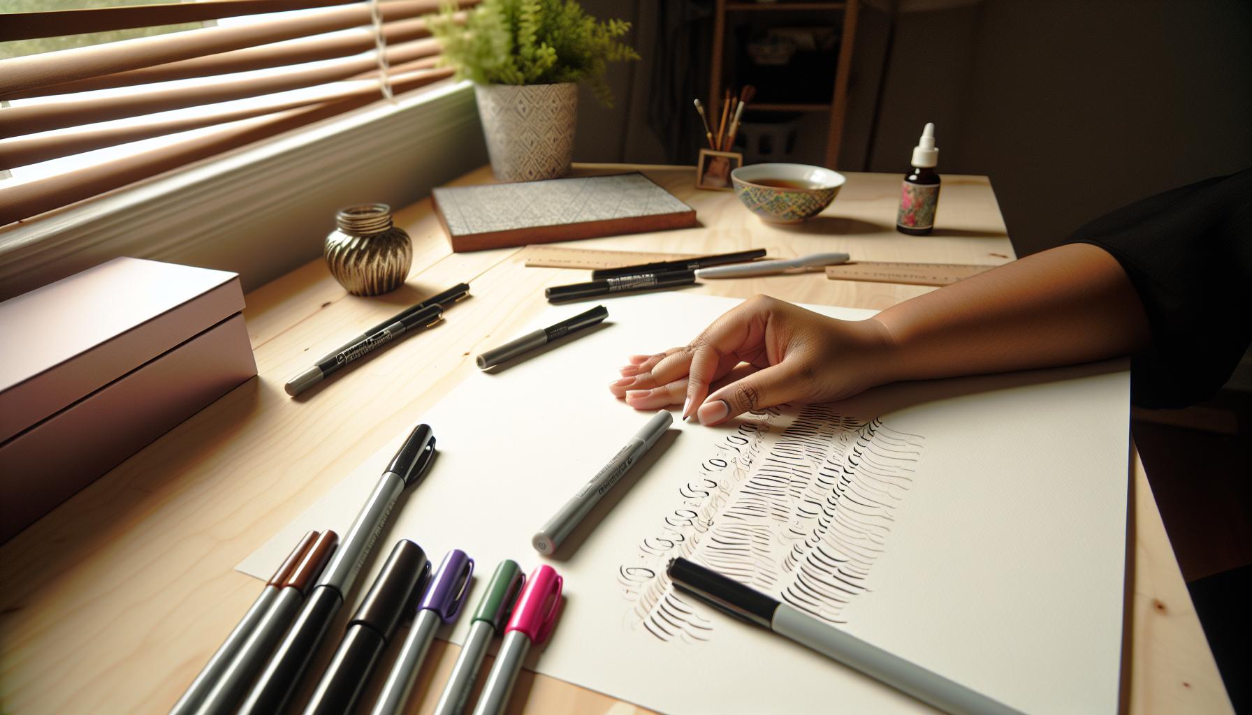
Essential Tools for Beautiful Faux Calligraphy
To create stunning faux calligraphy, having the right tools can make all the difference. You don’t need a huge investment or a complicated setup to get started; sometimes, simplicity is key. A good pen is your best friend. While many gravitate towards fancy brush pens, a simple ballpoint or gel pen can work wonders for faux calligraphy. The key is to choose something that feels comfortable in your hand and glides smoothly across your paper.
Here’s a quick list of essential tools to enhance your faux calligraphy experience:
- Pens: Gel pens, ballpoint pens, or even fine-tipped markers are ideal. Opt for pens with different widths to add variety to your strokes.
- Paper: Smooth, bleed-resistant paper is crucial. Look for sketchbooks, journal paper, or cardstock that works well with your chosen pen.
- Ruler or guidelines: While faux calligraphy is more relaxed than traditional styles, keeping your letters aligned is important. Use a ruler to draw light pencil lines that you can erase later.
- Practice sheets: Templates with letters or phrases can guide your practice. Find or create sheets that focus on different stroke techniques.
- Lightbox (optional): If you’re into layering techniques, a lightbox can help trace over designs, giving your work a polished finish.
Having these tools on hand will set you up for success. Remember, while tools can enhance your writing, the secret ingredient is your creativity. Experiment with different pen pressures and styles as you practice. Trust your instincts, and don’t be afraid to make mistakes-they often lead to unique and beautiful results. Embrace the process, and watch your faux calligraphy flourish!
Step-by-Step Guide to Create Faux Calligraphy
Creating faux calligraphy is not just a beautiful art form; it’s also an accessible craft that anyone can master with practice. Whether you’re aiming to personalize a card or add flair to your planner, these techniques can elevate your handwriting into something special. Here’s how to get started with step-by-step instructions that make the process enjoyable and rewarding.
First things first, you’ll want to lay out your guidelines. Lightly sketch horizontal lines on your paper using a pencil and ruler. This sets the foundation and keeps your lettering consistent. Aim for a space of about half an inch between each line for most letters. Once you’ve established your lines, it’s time to choose your writing instrument-anything from a gel pen to a fine-tipped Sharpie will work!
When you begin to write, focus on forming each letter. The key to faux calligraphy lies in thickening the downstrokes while keeping the upstrokes lighter. Start with a standard cursive or print letter then go back over it, applying more pressure on the downward strokes. For instance, consider the letter “a”: write it out normally, and on your second pass, add thickness to the bottom half of the stroke.
Next, practice connecting letters smoothly while maintaining consistent pressure. This can be tricky at first, but with a little perseverance, you’ll find your rhythm. Remember, slower is often better! You might even want to practice each letter separately before attempting full words, allowing you to gain confidence.
Finally, after completing your word or phrase, consider adding some embellishments. Little loops, extended tails, or flourishes can personalize your writing even more. Experiment with integrating varying levels of pressure to create unique looks. And don’t forget to have fun-every piece will turn out differently, adding to your charm. Enjoy the process of creating, and before long, you’ll find that faux calligraphy becomes second nature.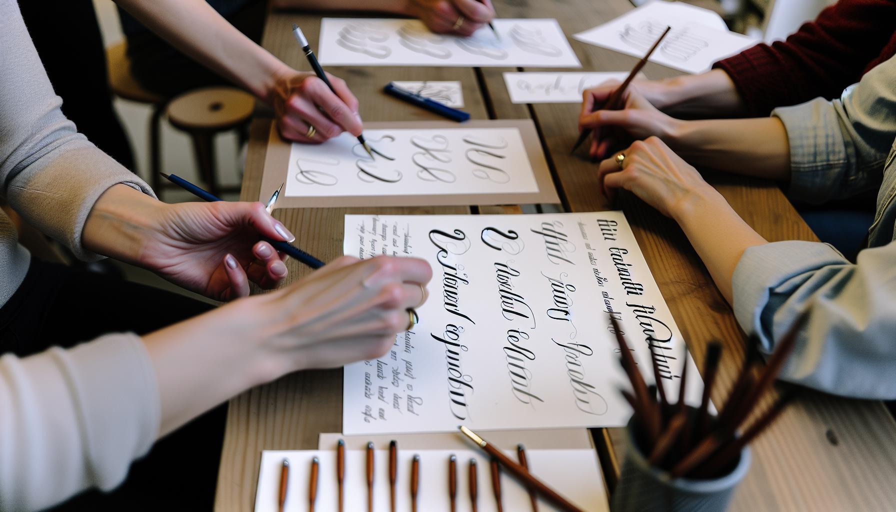
Mastering Basic Strokes for Elegant Lettering
To really get the hang of faux calligraphy, you need to master the basic strokes that form the foundation of beautiful lettering. Think of these strokes as the building blocks of your calligraphy style. Each letter is simply a combination of these strokes, and when you practice them, you’re not just learning the movements – you’re also training your hand to create elegant, fluid designs.
Start by familiarizing yourself with the two primary types of strokes: upstrokes and downstrokes. Upstrokes are light and delicate, requiring minimal pressure on your pen, while downstrokes should feel substantial – this is where you can push harder to make your letters stand out. When practicing, consider the dynamics of each stroke. For instance, a downstroke can be shaped with a slight curve to add character, while upstrokes can have a tapered finish for a polished look.
A great way to practice is to create a stroke worksheet. On this worksheet, you’ll outline a series of dashed lines that represent both upstrokes and downstrokes repeating in various patterns. Use rows of simple shapes-like loops, arches, and straight lines-instead of letters at first. This can help your hand get used to the flow without the complexity of forming complete characters right away.
Feel free to experiment with different pen angles and speeds. Moving your pen too quickly can lead to uneven strokes, so take it slow to achieve more control. Aim to consistently practice these foundational strokes; after a while, they’ll become second nature. By internalizing these simple yet powerful techniques, you’ll lay a strong groundwork to move into more complex lettering styles that will wow your friends and enhance your projects.
Common Mistakes and How to Avoid Them
Getting started in faux calligraphy can be a delightful journey, but it’s all too easy to fall into a few common traps. Many beginners underestimate the importance of consistent pressure control on their pen. If you find your upstrokes looking thick and your downstrokes thin, you’re likely mishandling your grip and pressure. Make sure to apply light pressure during upstrokes and heavier pressure on downstrokes. This contrast is what gives your letters their distinctive beauty.
Another common mistake is rushing the process. Faux calligraphy is meant to be elegant and fluid, but in the excitement of seeing results, many people speed through their strokes. This can lead to shaky or irregular lines. Take your time; slow, deliberate movements can make a world of difference. Try to cultivate a steady hand by practicing the basic strokes slowly. It’s also helpful to practice in small sections, focusing on complete control rather than trying to finish an entire word or phrase quickly.
Finally, don’t overlook the importance of proper paper. Beginners often use any available surface, which can lead to fraying or bleeding ink, detracting from the overall look of your work. Opt for smooth, bleed-resistant paper specifically designed for calligraphy. This small investment pays off, providing a more enjoyable and effective writing experience. By avoiding these pitfalls-pressure inconsistency, rushing your strokes, and choosing the wrong paper-you’ll set yourself up for success in mastering faux calligraphy. Happy lettering!
Enhancing Your Faux Calligraphy with Flourishes
Adding flourishes to your faux calligraphy can elevate your lettering from basic to breathtaking. These decorative elements not only enhance visual appeal but also lend an artistic flair that captures attention. Start by integrating simple curves and swirls at the ends of your letters. This creates a graceful transition that draws the eye and adds a touch of elegance.
Start Simple
Begin with basic flourishes. Aim for a natural extension of your letters rather than overcomplicating. For example, after completing a letter, let your pen flow into a gentle curve that connects to the next one. This fluid motion ensures your writing looks intentional rather than forced. Keep it easy-experimentation is key. Try different styles of flourishes; some may feel more natural for your hand than others.
Focus on Balance
As you incorporate flourishes, it’s essential to maintain balance in your piece. Too many embellishments can distract from the main text. Strike a balance by selectively adding flourishes to specific letters, particularly those that can benefit from a little extra flair, like the letters “f,” “g,” “y,” and “l.” Use flourishes that complement your lettering style-if your letters are bold and thick, consider thicker, more pronounced flourishes. Conversely, if your lettering is delicate, opt for lighter, more subtle flourishes.
Practice, Practice, Practice
Don’t hesitate to practice your flourishes on scrap paper. Develop unique styles that resonate with you, and let your personal touch shine through. Some calligraphers find that creating a library of their best flourishes, similar to a drawing book, can be incredibly helpful. This means you can borrow inspiration when crafting any project. Remember, the more you practice, the more natural these flourishes will feel, leading to greater cohesion in your overall design.
Incorporating these gentle enhancements into your faux calligraphy can transform simple text into stunning works of art. With each flourish, you’re not just adding decoration; you’re telling a visual story that invites viewers to stop, look, and appreciate the art of lettering.
Color Theory for Faux Calligraphy: Choosing Your Palette
Choosing the right color palette for your faux calligraphy can make all the difference in the impact of your designs. Color isn’t just about aesthetics; it communicates mood, attracts attention, and creates visual harmony. Start by understanding the basics of color theory: primary colors blend to form secondary colors, and these combinations influence how your calligraphy will be perceived. Using contrasting colors can help certain elements of your lettering pop, while analogous colors create a more harmonious and understated look.
Consider the Mood
Think about the emotion you want to convey through your work. For example, warm colors like reds and oranges evoke energy and excitement, while cool colors such as blues and greens promote calmness. If you’re creating a wedding invitation, soft pastels might be more appropriate compared to vivid neons for a party flyer.
Testing Your Palette
Before committing to a color scheme, experiment on scrap paper. Try blending different hues or layering colors to see how they interact. Use a color wheel as a guide: colors opposite each other, known as complementary colors, can create vibrant combinations, while colors next to each other provide a subtle yet sophisticated effect. Don’t hesitate to take risks-sometimes the most stunning results come from unexpected color pairings.
Limit Your Choices
While it might be tempting to use a rainbow of colors, keeping your palette limited to two or three main colors can enhance cohesion and sophistication. This approach also helps your faux calligraphy remain legible and maintains focus on the lettering itself. If you’re unsure which colors to choose, consider the occasion or theme of your project, and let that inspire your palette.
Incorporating thoughtful color choices into your faux calligraphy will elevate your lettering from good to extraordinary. It’s not just about filling letters with pretty hues, but about weaving a visual story that resonates with viewers. So grab your pens, find your colors, and let your creativity flow!
Incorporating Faux Calligraphy into Projects
When it comes to adding a personal touch to your projects, faux calligraphy shines as a versatile tool. Whether you’re creating greeting cards, wedding invitations, or personalized gifts, the elegant look of faux calligraphy can transform ordinary items into memorable keepsakes. This technique is not just about creating beautiful letters; it’s about enhancing your creativity and making your projects truly yours.
Start by considering your project’s theme and purpose. If you’re crafting a card for a loved one, think about how you can weave in personal touches through your lettering. Use colors that reflect their personality or add little illustrations that compliment your text. For instance, if you’re making a birthday card, you could use bright colors and fun flourishes to give it a festive feel. On the other hand, for something more sophisticated, like a wedding invitation, opt for muted tones with refined embellishments.
Practical Applications
Incorporating faux calligraphy can take many forms. Here are a few creative ideas:
- Personalized Gifts: Think about customizing items like mugs, tote bags, or even framed quotes using faux calligraphy. It adds a heartfelt element that mass-produced items lack.
- Event Decor: Use faux calligraphy for banners, place cards, or labels that elevate the visual appeal of your event. For example, table numbers at a wedding can be stunning when done in elegant faux script.
- Bullet Journaling: If you keep a journal or planner, incorporating faux calligraphy can make everything from headings to daily entries pop. It creates a cohesive and aesthetically pleasing look.
Don’t forget to practice your strokes before committing your ideas to the final piece! Experimenting on scrap paper can help you refine your style and find what resonates best with your vision. Plus, there’s immense satisfaction in the final reveal when your layout comes together. So grab your pens and make your projects standout with the beauty of faux calligraphy. It’s about expressing yourself and putting a little piece of your creativity into everything you create.
Inspiring Faux Calligraphy Styles to Try
Faux calligraphy offers a fantastic way to express your creativity, and trying out different styles can make your lettering stand out even more. One popular approach is modern faux calligraphy, which fuses traditional calligraphy elegance with a contemporary twist. This style often plays with varying stroke thickness, enabling a lively dance between thick downstrokes and delicate upstrokes. This technique gives your letters a dynamic flair that’s perfect for invitations or personal projects that need a fresh aesthetic.
Another style worth exploring is bouncy lettering. This fun technique allows the letters to “bounce” above and below the baseline, creating a sense of movement and joy. It’s particularly effective for greeting cards or inspirational quotes where you want to evoke a happy, energetic feeling. Play around with different angles and sizes to achieve that whimsical look. Don’t be afraid to let your letters overlap or connect in playful ways-this adds to the bounce!
You may also want to try flourished faux calligraphy, which incorporates intricate embellishments and swirls into your lettering. This adds a layer of sophistication and depth, making your projects truly stand out. Flourishing can transform simple text into art and is ideal for wedding invitations or elegant decor items. Consider using different colors for the flourishes to make them pop and complement your main lettering.
Finally, there’s block letter faux calligraphy, which is a wonderful choice for anyone who prefers a simpler, more structured look. This style is about creating bold, confident letters that maintain a sense of readability while still looking stylish. It’s perfect for signage, labels, or any project where clarity is key. Use a thick marker or brush pen to draw your letters and add light embellishments for that faux calligraphy touch.
Experimenting with these various styles not only enhances your skill but also opens up endless possibilities for creative projects. Dive into each style, mix and match elements, and find what resonates with your artistic voice. The beauty of faux calligraphy is that it invites you to explore and express your individuality through every stroke.
Digital Faux Calligraphy: Tools and Tips
Creating faux calligraphy digitally can be a game changer for your lettering projects. With the right tools at your fingertips, you can achieve stunning results that are perfect for everything from personalized gifts to professional designs. One of the best parts? You can easily edit, undo, and refine your work without worrying about ink smudges or paper tear-outs.
To get started, you’ll need a few key tools. First, invest in a good graphic design software or app that supports drawing capabilities. Programs like Adobe Illustrator, Procreate for iPad, or even free options like Krita or MediBang Paint are excellent choices. If you’re using a tablet, a stylus can give you more precision and comfort than a mouse, allowing for smoother strokes and better control. Additionally, brush packs designed specifically for faux calligraphy can simulate the effects of traditional brushes, giving you that authentic feel while working digitally.
Tips for Creating Digital Faux Calligraphy
- Layering is Key: Don’t shy away from using multiple layers. This allows you to adjust each section of your lettering independently-making corrections easy and enhancing your overall design. For instance, create a separate layer for shadows or a highlight effect to make your letters pop.
- Explore Text Effects: Take advantage of text effects in your design software. Many programs let you add strokes, shadows, or glows effortlessly. These can add depth and interest without requiring intricate work on your part.
- Play with Color: Digital faux calligraphy offers the flexibility to experiment with color palettes. Use vibrant colors or soft pastels, and consider applying gradients for a modern twist. The ability to quickly change colors and test different combinations can lead to unique outcomes.
- Practice with Brushes: Familiarize yourself with different brush settings. Adjust their size, opacity, and blending modes to explore various styles and textures. You can create a range of effects, from delicate and airy to bold and striking.
- Save Your Work: Don’t forget to save your designs regularly. Use different file formats depending on your needs-like PNG for transparent backgrounds or SVG for scalable graphics. This way, you can always return to your masterpiece for future adjustments or iterations.
With these tools and tips, you’ll unlock a new level of creativity in your faux calligraphy endeavors. The beauty of digital platforms is the freedom to experiment boldly, so dive in and let your artistic spirit soar!
Sharing and Showcasing Your Calligraphy Creations
There’s something incredibly satisfying about sharing your artistry with the world, especially when it comes to faux calligraphy. Whether you’ve just completed a beautiful piece or have been practicing for a while, showcasing your creations can inspire others and create a sense of community. Social media is a fantastic platform for this, allowing you to share your progress and finished works with a global audience.
Start by taking high-quality photos of your calligraphy. Natural lighting is your best friend-always opt for daylight if possible. Position your work against a clean backdrop to help it stand out. Filters can enhance your images, but keep them minimal to maintain the authentic look of your handwriting. Once your visuals are ready, platforms like Instagram, Pinterest, and Facebook are perfect for sharing. Use relevant hashtags such as #fauxcalligraphy, #handlettering, and #letteringart to reach those who share your passion.
Connecting with fellow calligraphers can also be incredibly rewarding. Consider joining online communities or forums where you can present your work and receive constructive feedback. Engaging in challenges or collaborations can push you creatively and expand your skill set. Don’t shy away from sharing your process through time-lapse videos or step-by-step snapshots. This transparency not only showcases your techniques but also invites others to learn and grow alongside you.
Finally, consider creating a dedicated portfolio online. A personal blog or website can serve as the perfect showcase for your calligraphy. It’s a space where you can tell the story behind each piece, discuss your inspirations, and connect with your audience more deeply. Not only does this elevate your work, but it also enhances your credibility as a calligraphy artist. So grab your favorite pen, get creative, and start sharing; your next follower might just be waiting to see your masterpiece!
FAQ
Q: What are the best pens for faux calligraphy?
A: The best pens for faux calligraphy are brush pens, gel pens, or even fine-liners. Look for pens that allow for flexible strokes to create thick and thin lines. Brands like Tombow or Micron are popular among beginners. Explore the Essential Tools for Beautiful Faux Calligraphy section in the main article for more tips.
Q: How can I practice faux calligraphy effectively?
A: To practice faux calligraphy effectively, start with simple letters and progress to joining them into words. Use worksheets or create your own guidelines. Consistent practice with different strokes will enhance your skills over time. Refer to the Step-by-Step Guide to Create Faux Calligraphy for structured practice.
Q: Can I do faux calligraphy with a regular pen?
A: Yes, you can use a regular pen for faux calligraphy! While brush pens create the most dynamic strokes, a ballpoint or gel pen can work well for basic designs. Just focus on varying pressure for thick and thin lines. Check out Common Mistakes and How to Avoid Them for tips on improving your technique.
Q: What surfaces are best for faux calligraphy?
A: The best surfaces for faux calligraphy include smooth paper or cardstock to allow the pen to glide easily. Practice pads specifically made for calligraphy are also great. Experiment with mats to see which ones work best for your style, as suggested in the Incorporating Faux Calligraphy into Projects section.
Q: How long does it take to learn faux calligraphy?
A: Learning faux calligraphy can vary in time; beginners may see basic improvements in a few weeks with daily practice. To master elegant lettering takes longer, but consistent efforts make a significant difference. Explore the Mastering Basic Strokes for Elegant Lettering section for structured learning paths.
Q: What should I avoid when starting faux calligraphy?
A: Avoid using low-quality pens, as they can hinder your progress. Don’t rush your practice; focus on control and precision. Additionally, steer clear of overly complicated styles at first. Familiarize yourself with the Common Mistakes and How to Avoid Them section for further insights.
Q: Is faux calligraphy suitable for beginners?
A: Absolutely! Faux calligraphy is ideal for beginners because it simplifies traditional calligraphy techniques. You can achieve beautiful results without needing specialized tools or training. Check out Getting Started with Faux Calligraphy Techniques for a comprehensive overview tailored for newcomers.
Q: How do I incorporate faux calligraphy into my projects?
A: Incorporate faux calligraphy by adding lettering to greeting cards, wall art, or planners. Experiment with different styles to match the theme of your project. For creative ideas, refer to the Incorporating Faux Calligraphy into Projects section in the main article for practical inspiration.
The Conclusion
Now that you’ve learned how to create stunning faux calligraphy with just a regular pen, it’s time to put your skills to the test! Remember, practice makes perfect, so don’t hesitate to grab our free faux calligraphy worksheets to refine your technique and unleash your creativity. Ready for more? Check out our comprehensive guide on mastering decorative lettering, or dive into our expert tips on enhancing your calligraphy projects for that personal touch that truly impresses!
Feeling inspired? Share your creations with us in the comments below-we’d love to see your work! And if you want to stay updated with more lettering tips and tricks, be sure to sign up for our newsletter. Your journey into the art of faux calligraphy starts now. Keep practicing, and watch your skills flourish!
Get our latest guides, news, and insights highlighted in your Google Search & AI Overviews.