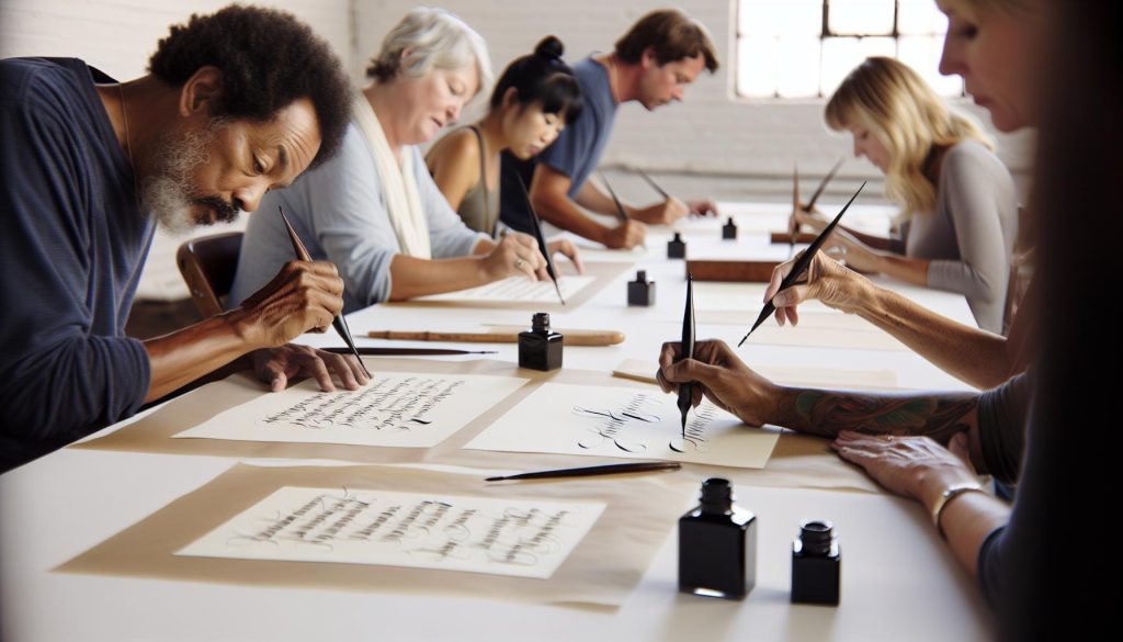
Have you ever admired beautifully crafted letters and wished you could create something similar? Using a calligraphy dip pen can unlock your potential for stunning lettering that elevates everyday writing into an art form. Mastering this tool not only enhances your creativity but also gives a personal touch to everything from invitations to journal entries.
In this guide, we’ll explore the essentials of using a dip pen-covering everything from choosing the right pen to mastering basic strokes. Whether you’re a complete beginner or looking to refine your skills, this journey into calligraphy will inspire you to put pen to paper and transform your lettering today. Get ready to discover tips and techniques that will help you express your unique style through elegant script. Let’s dive in!
How Calligraphy Dip Pens Work: A Beginner’s Guide

Using a calligraphy dip pen might seem a bit daunting at first, but once you understand the basics, you’ll find it is one of the most rewarding tools for creating beautiful lettering. The magic of a dip pen lies in its structure: a metal nib attached to a handle that you dip into ink. This simple yet effective design allows for incredible control over line thickness and flow, making it perfect for varying your stroke pressure to create stunning effects.
To get started, it’s crucial to understand how ink interacts with the nib. When you dip the pen, the nib absorbs a small amount of ink through capillary action. The key to a smooth writing experience is finding the right angle. Typically, holding the pen at about a 45-degree angle to the paper will give you the best results. This angle allows the nib to glide smoothly over the surface without skipping or blobbing. It’s also important to note that different nibs provide various line qualities, so experimenting is essential.
Another aspect to consider is the type of ink you use. Calligraphy inks come in a range of formulations-some are thicker, ideal for bold strokes, while others are more fluid for finer detailing. Testing different inks can greatly influence your final piece. Remember, practice is crucial. The more you experiment with pressure and angles, the better your control over the pen will become, leading to more beautiful letters and intricate designs in your work.
Incorporating these basics into your practice will help you transition from a beginner to a confident calligrapher. The dip pen is not just a tool; it’s a gateway into a world of creativity where each letter becomes a work of art.
Essential Tools for Calligraphy Success
Using a dip pen can feel like stepping into a magical world of letters, but the right tools can make all the difference in your calligraphy journey. To truly excel, you’ll need more than just a pen; it’s about creating a well-rounded setup that enhances your writing experience. Let’s dive into the essential tools that every calligrapher should consider.
First off, a good quality dip pen is crucial. Invest in a pen that feels comfortable in your hand, with a nib that suits your style. There are various types of nibs available, each designed for different types of strokes and effects. For beginners, it’s recommended to start with a flexible nib, which allows for more dynamic line variation. Keep in mind that you’ll also need an assortment of nibs as you grow; each offers unique possibilities and textures for your work.
Next up is ink. The choice of ink can significantly affect your results. I’ve experimented with both traditional calligraphy inks and modern alternatives. While traditional inks provide depth and richness, modern options might offer more convenience or specific colors. Always test your ink with your nib to find the perfect match. And don’t forget about a good ink bottle with a wide opening – it makes dipping so much easier!
Another indispensable tool is quality paper. Not all papers are created equal. A smooth, heavy-weight paper will prevent bleeding and allow for a clean application of ink. Try to find paper that has just the right texture; this can enhance your control and the overall look of your lettering. Remember, practicing on various surfaces can help you see what works best for your technique and style.
Lastly, don’t underestimate the power of a comfortable workspace. Good lighting, a supportive chair, and an uncluttered surface can have a surprisingly positive impact on your concentration and creativity. Adding a few decorative storage solutions for your pens and inks can also help keep everything organized and inspire you to write.
By gathering these essential tools, you’ll set yourself up for success. Calligraphy is as much about the experience as it is about the outcome, and having the right equipment will elevate both the process and the results. Get ready to transform your lettering!
Choosing the Right Calligraphy Dip Pen for You

Choosing a calligraphy dip pen isn’t just a task; it’s an adventure in creativity! The right pen can dramatically influence your lettering experience, helping you achieve the expressive style you desire. So how do you choose the perfect one? It all boils down to understanding your needs and preferences.
First, consider the type of nib. Nibs come in various shapes and sizes, each designed to produce different line qualities. For beginners, a flexible nib is a solid choice. It allows for more dynamic strokes and can enhance your control over the thickness of your lines. Pointed nibs are great for fine detail work, while broad-edged nibs are better suited for classic scripts like Gothic or Italic. Don’t hesitate to try a few different types to see which feels best in your hand.
Next, look at the pen holder. Pen holders come in straight, oblique, and even ergonomic designs. A straight holder is typically easier for beginners, while an oblique holder can give you an edge when creating specific styles, particularly those requiring a slanted approach. Choose a holder that feels comfortable and balanced when you write; a good grip can make all the difference during longer sessions.
Lastly, consider the overall build quality and price. While it might be tempting to go for cheaper options, investing in a well-made pen can boost your confidence and enhance your writing experience. Quality pens often provide better ink flow and durability. Don’t shy away from seeking advice at your local art supply store; experienced staff can help you find the right tools tailored to your journey in calligraphy.
With the right dip pen in hand, you’re on your way to mastering this beautiful art form. Remember, the goal isn’t perfection but finding joy in the process of creating beautiful letters. Happy writing!
Mastering Ink Types: The Heart of Calligraphy

The choice of ink is a pivotal decision that can dramatically alter your calligraphy experience. Not only does it affect the flow and appearance of your letters, but it also influences how easily you can achieve the desired effects in your writing. For beginners exploring the world of calligraphy, understanding the various types of ink can feel overwhelming, but once you break it down, it becomes much simpler.
When diving into ink types, you’ll typically encounter three main categories: bottled ink, ink cartridges, and DIY inks. Each type has its own merits, allowing you to select based on your comfort level and artistic goals. Bottled inks are versatile but require a bit of care-perfect for those who enjoy experimenting with colors and shades. Ink cartridges, on the other hand, are hassle-free; just pop them in your pen, and you’re ready to go. If you’re feeling adventurous, DIY inks can be crafted from various materials, offering a unique texture and visual appeal that can’t be found in pre-made options.
The consistency and flow of ink are also vital. For smoother writing, go for inks specifically formulated for calligraphy, which have a balanced viscosity that ensures they flow easily from the nib without pooling. Colors matter, too. Vivid shades can make your work stand out, while more subdued tones might lend an air of sophistication to your pieces. Remember, it’s worth testing different inks to find the one that matches your nib and personal style best. It’s a good practice to create a small swatch with each ink you try, making it easier to visualize how it behaves on paper.
In the world of calligraphy, mastering the right ink not only enhances your work but also enriches your creative process. So don’t shy away from experimenting. As you play with different inks, you’ll find the combinations that inspire you-turning a simple letter into a canvas of expression. Your journey in calligraphy is an art of exploration, and the ink you choose is the first step on that path. Happy writing!
Basic Lettering Techniques for Beautiful Results

To create beautiful lettering with your dip pen, mastering a few fundamental techniques is essential. Calligraphy isn’t just about what you write; it’s about how you make it look. The elegance of your letters relies on consistent pressure, strokes, and a keen eye for detail. You’ll be amazed at what a bit of practice can achieve.
Start by understanding the two primary strokes in calligraphy: upstrokes and downstrokes. Upstrokes are light and delicate; think of them as whispering along the page. These occur when you write from the bottom to the top of a letter, applying minimal pressure. In contrast, downstrokes are bold and assertive, created by pressing down harder as you move from top to bottom. This variation not only gives your letters their characteristic flair but also creates dynamic contrast that enhances your overall design.
Practice Your Basic Strokes
Before diving into full letters, dedicate time to practice these strokes individually. Here’s a simple exercise you can try:
- Using your dip pen, draw a series of vertical lines. Vary your speed and pressure. Notice the differences in thickness.
- Next, create horizontal lines. Begin with a light pressure, transitioning to a heavier one as you draw downwards.
- Then, practice curves. Try small loops and larger swirls. These shapes are foundational for many letters.
After you feel confident with these strokes, start combining them to form basic letters. Begin with simple sans-serif letters, like “l” and “i.” This will help you focus on the mechanics without overwhelming yourself with complexity.
Letter Height and Spacing
Another key aspect of beautiful calligraphy is letter height and spacing. Consistency is critical here. Use an outline or guide to help keep your letters uniform. This practice will not only make your work look polished but also train your hand to maintain the same size and shape as you write. A common recommendation is to set a guide line about every 1/4 inch high, ensuring your letters sit evenly without crowding.
In calligraphy, each stroke tells a story-whether it’s a delicate upstroke or a powerful downstroke. Embrace the journey of fine-tuning these basic techniques, and you’ll find that each step enhances your skills, allowing your creativity to shine. So grab your dip pen and start practicing; the world of beautiful lettering awaits!
Step-by-Step: How to Hold Your Dip Pen
Getting your grip right on a dip pen can be the make-or-break factor in achieving stunning calligraphy results. The way you hold your pen affects everything from line quality to comfort during long practice sessions. Here’s how to position your hand for optimal control and fluidity.
First, hold the pen with the nib angled at about 45 degrees to the paper. This angle is crucial, as it allows the nib to glide smoothly and creates those beautiful thick and thin lines characteristic of calligraphy. Place your thumb and index finger around the nib, while your middle finger should support the barrel of the pen. Aim to have a relaxed grip; too much tension will restrict your motion and lead to awkward strokes.
Finding Your Comfort Zone
You might find comfort in a few different grips. A common method is to use a tripod grip, similar to how you hold a regular pen or pencil. Another approach is the overhand grip, where you position your fingers further up the shaft of the pen, which can provide better control for larger strokes. Experiment with both to see which feels more natural to you.
Wrist and Arm Position
Positioning isn’t just about your fingers; pay attention to your wrist and arm as well. Keep your wrist relaxed and slightly elevated, allowing your hand to move freely without excessive strain. Avoid anchoring your wrist too firmly to the table; this can limit your range of motion. Instead, let your arm do some of the work. As you write, your hand should glide across the paper, with gentle movements flowing from your shoulder and elbow rather than just the wrist.
Practice makes perfect, and as you refine your grip and positions, you’ll notice improvements in your control and the overall art of your letters. Take your time, be patient with yourself, and soon, you’ll find the grip that feels just right for your calligraphy journey.
Practice Makes Perfect: Tips to Improve Your Skills
To truly excel in calligraphy, consistent practice is your best friend. The more you wield that dip pen, the more you’ll discover the intricacies of your style and technique. But practice doesn’t just mean mindlessly repeating letters. It requires intentional effort and focus. Here are some tips to help you hone your craft.
Start by setting realistic goals. Instead of aiming to master an entire alphabet in one sitting, focus on a few letters each week. Concentrate on the curves and angles of each character, experimenting with different pressure levels on the nib. A solid exercise is to write the same letter in various sizes and styles. This not only builds muscle memory but also reinforces your understanding of how to manipulate your pen for different effects.
Practice with Purpose
Diversify your practice tasks; incorporate drills for specific strokes, as they are the foundation of beautiful lettering. For example, create simple exercises that emphasize loops or straight lines. Use graph paper or specially designed calligraphy sheets for guidance. Many beginners overlook the importance of good foundational strokes, but these are critical for developing confidence in your overall technique.
Lastly, keep a journal of your progress. Documenting your daily practices and noting areas for improvement can be incredibly helpful. Plus, don’t hesitate to share your work with others, whether through social media or calligraphy groups. Receiving feedback and seeing others’ styles can inspire you and offer new ideas to integrate into your practice. Remember, every pen stroke is a step forward on your journey-embrace it, and let your passion guide you towards mastery.
Exploring Different Calligraphy Styles
Venturing into the world of calligraphy, you’ll quickly discover a tapestry of styles waiting to be explored, each with its own flair and characteristics. Understanding these different calligraphy styles not only expands your creative palette but also helps you find your own unique voice in your lettering practice. From elegant flourishes to bold strokes, each style tells a story and conveys emotions in different ways.
One of the most popular styles is Copperplate. Recognized for its graceful, looping letters, Copperplate is often used for formal invitations and elegant stationery. The key to mastering this style lies in the angled strokes executed with a pointed nib, which varies the thickness of your lines based on the pressure applied. A strong practice tip is to focus on fluidity; let the pen glide across the paper, allowing ink to flow seamlessly from your nib.
Another captivating style is Gothic (or Blackletter), known for its intricate, angular forms. It’s striking and perfect for creating dramatic effects on your pieces. The challenge here is to maintain consistency in letter height and width while preserving the sharp angles that define the style. A helpful technique is to use a grid to keep your letters aligned and uniform, which can significantly enhance your overall results.
If you’re drawn to something more modern and playful, consider Brush Calligraphy. This style allows for a more freestyle approach, combining the pen’s mechanics with artistic expression. Using a brush pen, you can create soft and sweeping strokes, making it ideal for projects like signage or personal projects. Experiment with different brush sizes and pressure variations to find a rhythm that feels natural to you.
Finally, explore styles like Modern Calligraphy, which flourishes on its flexibility and innovation. This approach borrows elements from traditional styles but emphasizes personal flair and creativity. By blending techniques from various forms, you can develop a signature style that reflects your personality. Don’t shy away from experimenting-let your intuition guide your pen to create something truly unique.
In essence, the beauty of calligraphy lies in the vast array of styles to choose from. Each has its roots in history but also leaves room for innovation and personal expression. Dive into these various styles and see which ones resonate with you. Finding joy in your practice is ultimately what will elevate your lettering skills and produce beautiful, meaningful work.
Creative Projects to Showcase Your Calligraphy
Creating tangible projects is one of the most satisfying ways to showcase your calligraphy skills. Not only do these projects allow you to practice and refine your techniques, but they also provide personalized gifts, decorations, or keepsakes that reflect your unique style. Here are some engaging ideas to turn your calligraphy into beautiful, shareable art.
- Custom Greeting Cards: Design personalized greeting cards for various occasions-birthdays, weddings, or holidays. Use your calligraphy for heartfelt messages, and consider adding illustrations or embellishments to make them even more special.
- Framed Art Prints: Create elegant pieces of art by writing quotes or poems in your favorite styles. Choose high-quality paper and frame your work under glass to preserve it and enhance its beauty.
- Wedding Invitations and Name Cards: Use your skills to craft stunning invitations and table settings. Calligraphy adds a touch of class that is perfect for any special event, especially weddings.
- Hand-Lettered Signs: Make decorative signs for your home or special events. Whether it’s a menu for a party or a welcoming sign for your home, your calligraphy will add a personal touch to any space.
- Quotable Wall Art: Hand-letter a favorite quote or mantra and hang it on your wall. This not only gives you everyday inspiration but also showcases your work creatively.
These projects offer the perfect blend of creativity and utility. Each piece you create not only refines your calligraphy skills but also allows you to express your personality. Don’t hesitate to experiment with different styles and colors; the key is to enjoy the process. Share your creations online or with family and friends, and perhaps even consider selling your calligraphy art at local markets or online platforms. Your unique artistic voice deserves to be celebrated!
Common Mistakes and How to Avoid Them
When starting with calligraphy, it’s easy to slip into some common pitfalls that can hinder your progress. Even seasoned writers can overlook essentials that lead to frustration or diminished results. Recognizing these mistakes early can dramatically enhance your learning curve and keep your enthusiasm alive. Here’s a rundown of frequent missteps and how you can sidestep them.
- Inconsistent Pressure: One of the fundamental elements of calligraphy is mastering pressure control on your dip pen. Many beginners apply uneven pressure, resulting in inconsistent line thickness. Practice applying light pressure on upward strokes and more pressure on downward strokes. This contrast is what creates beautiful, dynamic lettering.
- Skipping Warm-Up Exercises: Just like athletes stretch before a game, you should warm up your hand before diving into serious lettering. Skipping this step can lead to cramping and inconsistent movement. Spend at least 5-10 minutes doing basic strokes to loosen up.
- Poor Paper Choice: Not all paper is created equal for calligraphy. Using unsuitable paper can lead to smudged ink and frustration. Opt for smooth, bleed-proof paper designed specifically for inks. Experiment with different mediums until you find what works best for you.
- Ignoring Ink Consistency: The viscosity of your ink plays a crucial role in your results. Too thick and it clogs your nib; too thin and it runs everywhere. Always test a small amount before diving into your project to ensure it flows smoothly from the nib.
- Neglecting Nib Care: Your nib is your lifeline in calligraphy. Forgetting to clean it after use can lead to a buildup of ink residue, affecting performance. Always clean your nib with warm water and a soft cloth after your session to keep it in top shape.
By being aware of these common mistakes, you can avoid frustration and enjoy your journey into the art of calligraphy. Remember, practice and patience are your best allies. Don’t hesitate to experiment, embrace your unique style, and ultimately, let your passion guide you.
Advanced Techniques to Elevate Your Lettering
Mastering advanced techniques in calligraphy can truly elevate your work from basic lettering to stunning art pieces. One of the most impactful elements is understanding and utilizing contrast. By varying the thickness of your lines through intentional pressure control, you can create more dynamic and engaging letters. Practice this with different nib sizes; broader nibs naturally produce thicker lines, while finer ones can help you express delicate details.
Another powerful technique is incorporating flourishes. These embellishments can transform standard letters into intricate designs. Start by practicing simple swirls and accents, then gradually integrate them into your lettering. Flourishes are not just pretty; they bring personality and flair to your pieces, making them unique. A well-placed flourish can draw the eye and add a touch of elegance that elevates the overall design.
Experimenting with layering is also essential. This involves going over your strokes multiple times to create a bolder effect. When you’re confident with your line work, use this technique to add depth and a three-dimensional feel to your letters. Don’t shy away from color, either-mixing inks or using colored paper can amplify your creativity.
Finally, embrace textures and backgrounds. Consider using different types of paper, such as textured or handmade, which can add another layer of visual interest. You might also incorporate mixed media-combine your calligraphy with watercolor or digital elements to craft something truly eye-catching.
By implementing these advanced techniques, you’ll not only improve your skills but also find joy in creating art that reflects your personal style. Remember, calligraphy is an evolving practice; the more you explore, the more your unique voice will emerge.
Inspiring Resources for Calligraphy Enthusiasts
Engaging with the world of calligraphy isn’t just about mastering techniques; it’s also about immersing yourself in a wealth of resources that can enhance your journey. From inspiring books to online communities and workshops, the right resources can make all the difference in transforming your lettering skills.
One standout resource is the book “The Art of Calligraphy” by David Harris, which dives deep into the history and techniques of various styles. It’s filled with stunning visuals and practical exercises that can help beginners grasp fundamental concepts while inspiring seasoned artists to explore new territories. You might also consider “Modern Calligraphy: A Beginner’s Guide to Pointed Pen Lettering” by Courtney Cerruti for a more contemporary approach that emphasizes creative expression.
Online platforms like Skillshare and Udemy offer comprehensive courses ranging from beginner to advanced levels. These can be invaluable for hands-on learning that adapts to your schedule. Many instructors provide downloadable resources to practice with, making it easy to integrate what you learn.
Don’t overlook social media, particularly Instagram and Pinterest, where talented calligraphers share their work, techniques, and personal tips. Following hashtags like #CalligraphyCommunity or #ModernCalligraphy can lead you to tutorials, challenges, and even collaborations.
Lastly, local art workshops and calligraphy clubs or meet-ups can build connections with fellow enthusiasts. Being part of a community not only provides motivation but also avenues for feedback, critique, and shared learning experiences. Joining sites like Meetup can help you find groups near you.
These resources aren’t just tools; they’re gateways to discovering your unique voice in calligraphy. Dive in, explore, and let the inspiration fuel your artistry.
FAQ
Q: What are the best inks for use with a calligraphy dip pen?
A: The best inks for calligraphy dip pens are those specifically designed for this art form, such as iron gall ink, black acrylic ink, or bottled fountain pen ink. These inks flow smoothly and offer vibrant colors, ensuring your lettering looks stunning. Always test your ink on scrap paper to see how it performs before using it on your final project.
Q: How can I improve my calligraphy pen pressure technique?
A: Improving your calligraphy pen pressure involves practicing controlled strokes. Try holding your pen at different angles and experiment with varying pressure to see how it affects line thickness. *You can practice on smooth, heavy paper to feel the difference in pressure more clearly.* Regular exercises like curves and loops help build muscle memory for better control.
Q: When should I replace the nib on my calligraphy dip pen?
A: You should replace the nib on your calligraphy dip pen when it becomes dull, bent, or clogged. If you notice your lines are inconsistent or the ink is not flowing well, it’s time for a new nib. *Regularly clean your nib after each use to prolong its life.*
Q: What surfaces are best for practicing calligraphy with a dip pen?
A: The best surfaces for practicing calligraphy include smooth, heavyweight papers designed for ink applications, such as Bristol board or watercolor paper. These surfaces prevent bleeding and feathering, allowing for clean lines. *Avoid textured or flimsy paper, which can disrupt your writing.*
Q: How long does it take to learn calligraphy with a dip pen?
A: The time it takes to learn calligraphy with a dip pen varies per individual, but *most beginners see improvement within a few weeks of consistent practice.* Set aside time daily to work on basic techniques, and be patient with yourself as skills develop over time.
Q: What are common mistakes beginners make with dip pens?
A: Common mistakes include using too much pressure, not cleaning the nib properly, and neglecting to practice basic strokes. Many beginners also grip the pen too tightly, leading to fatigue. *Focus on developing a relaxed grip and mastering strokes before moving to complex letters.*
Q: Can I use a calligraphy dip pen for other types of art?
A: Yes, calligraphy dip pens are versatile tools suitable for various art forms, including illustrations and sketching. You can use different nibs for various effects, such as fine lines or broader strokes. *Experiment with style combinations to enhance your artwork and lettering projects.*
Q: Where can I find calligraphy inspiration for my projects?
A: You can find inspiration for your calligraphy projects in books, online tutorials, and social media platforms like Instagram and Pinterest. Joining calligraphy communities or workshops can also provide ideas and motivation. *Look through your favorite styles and incorporate them into your personal pieces.*
In Conclusion
Now that you’re armed with the knowledge of how to use a calligraphy dip pen, it’s time to unleash your creativity! Remember, practice is key to mastering this beautiful art form, so grab that pen and start transforming your lettering today. Whether it’s for stunning cards or personalized gifts, your newfound skills will impress everyone around you.
Don’t stop here! Explore our resources on calligraphy techniques and check out our examples of beautiful fonts created with Calligraphr for inspiration. If you have questions or want to share your progress, drop a comment below – we love hearing from you! For more tips and tricks, consider signing up for our newsletter or joining our community for ongoing support. Your journey into the world of calligraphy is just beginning, and we can’t wait to see what you’ll create next!